Portal UX live | Full visual redesign design-complete, pending client implementation

My Role: Lead Designer — Branding, User Flows, Wireframing, UI Design, Prototyping, Multi-Service Sub-Branding
Platform: Patient portal, Nurse dashboard, Doctor dashboard, Admin panel, marketing website
Timeline: Multi-phase engagement covering portal MVP, then expanded rebrand and multi-service redesign
Status: Portal UX live. Full visual redesign with five-service sub-branding system design-complete, pending client implementation.
Live link: trimslim.com
Context
TrimSlim is a US-based telehealth platform that began as a single-service weight loss treatment program. Patients submit an eligibility questionnaire, are reviewed by a nurse, assigned to a doctor who determines their medication, and then gain access to a patient portal to manage their treatment. The engagement covered two phases: first, designing the complete portal MVP to replace a manual, email-based patient management process; then, a full rebrand and multi-service expansion to cover five treatment categories with a colour-coded sub-branding system.
The Problem
Phase 1 problem: TrimSlim launched with no unified portal. Nurses reviewed patients by email or phone, doctors were assigned manually, and there was no patient-facing interface to track status, make payment, or manage treatment. The process did not scale and had no pipeline visibility for any party.
Phase 2 problem: TrimSlim expanded from one service (weight loss) to five service categories. The existing single-service platform could not accommodate the new scope. Four distinct user roles (Nurse, Doctor, Patient, Admin) each needed redesigned interfaces that could surface the correct service context without fragmenting the brand into five separate products.
My Role and Constraints
I was the lead designer across both phases of TrimSlim. In Phase 1 I owned the patient eligibility questionnaire redesign, the nurse dashboard, the doctor dashboard, the patient portal, and the marketing website. In Phase 2 I expanded this to include the five-service sub-branding system, the Admin panel, redesigned marketing website with service-specific navigation, and the full colour-coded sub-branding architecture across all platforms. HIPAA compliance was a structural constraint on all communication and data flows in both phases.
Research and Discovery
Phase 1:
I mapped the complete patient journey from form submission to active treatment, identifying every handoff between the patient, nurse, and doctor. The workflow operated through six patient status states that drove all interface decisions: In Nurse Review, Reviewed - Pending Appointment, Nurse Reviewed - Not Eligible, Doctor Reviewed - Not Eligible, Doctor Reviewed - Approved, and Active Patient.
I audited the intake questionnaire to understand what eligibility data was collected: gender at birth, height, weight (for BMI calculation), health goals, prior weight loss attempts, existing diagnosed conditions (high cholesterol, fatty liver disease, high blood pressure, pre-diabetes type 2), date of birth, and contact and shipping details. This data taxonomy informed the nurse dashboard's patient card design directly.
Phase 2:
I researched multi-service healthcare platform sub-branding (Hims and Hers, Roman, Nurx) to understand how successful telehealth platforms differentiated service categories visually without fragmenting the parent brand. The most effective systems used a consistent neutral base with a single-color accent per service category applied to navigation indicators and category headers only — not to full interface themes. Full color themes per service created visual fragmentation that made the platform feel like five separate products.

Key Design Decisions
Decision 1: Patient status as the shared vocabulary across all roles
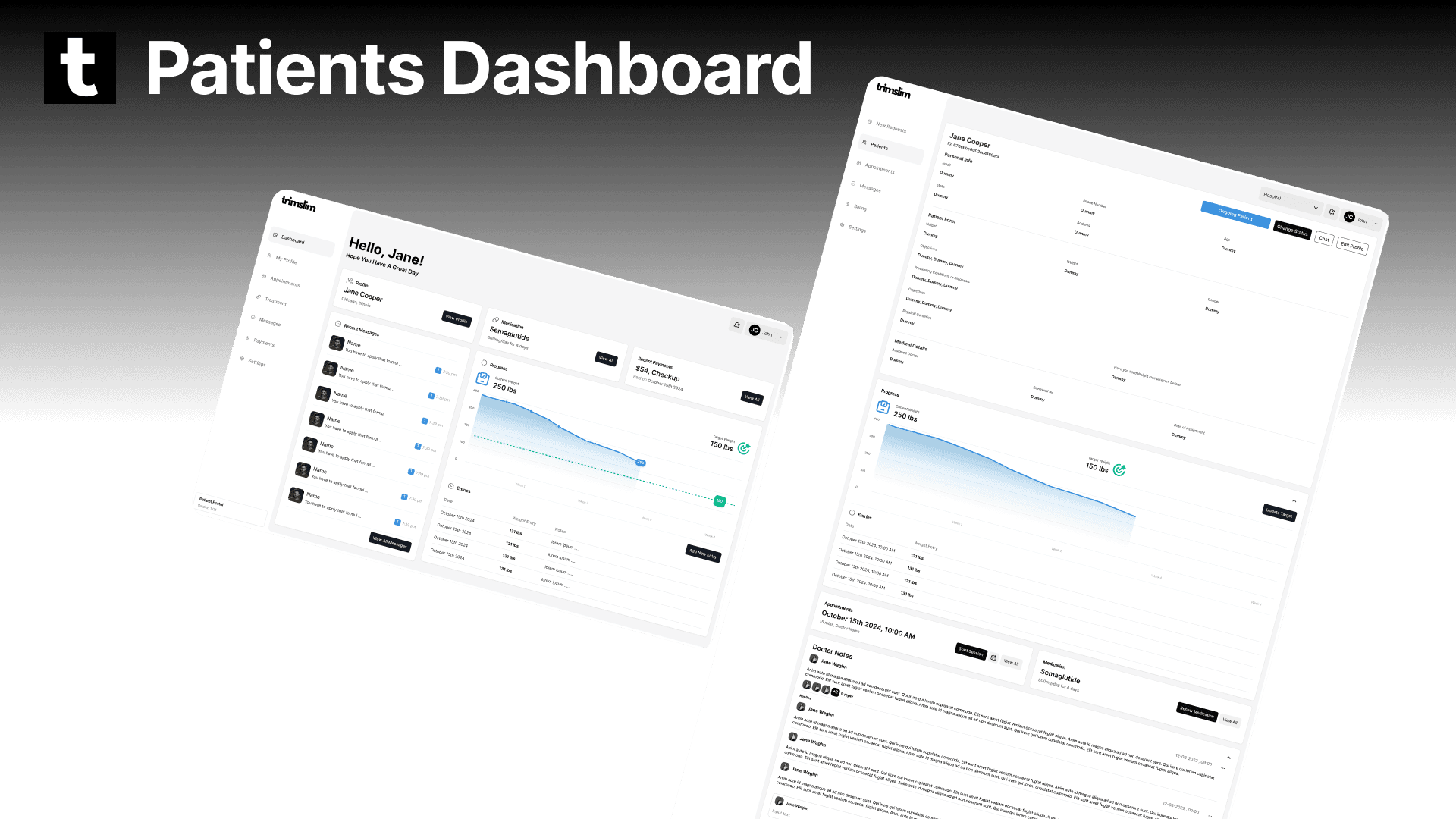
All three role interfaces (Nurse, Doctor, Patient) are organized around the same patient status states. The nurse sees a queue ordered by status. The doctor sees an assigned patient list with status indicators. The patient portal's home view shows the user's current status in plain language with an explanation of what it means and what happens next. This shared status model meant all parties could understand any patient record without needing to read a history log.
Decision 2: Portal activation triggered by doctor approval only
The patient creates their portal account only after doctor approval — triggered by an automated email prompting them to set up access. Before approval, the patient has no portal login. This means the patient portal never appears empty or confusing: when a patient logs in for the first time, they already have an approved medication and can proceed directly to payment and treatment tracking. The portal design was built for an approved, active patient as its default state.
Decision 3: Service color as a wayfinding signal, not a full interface theme
For the multi-service redesign, the five-category accent colors were applied specifically to: the service navigation tab (indicating which service context the user is in) and the category page header. They were not applied to body content, dashboard elements, action buttons, or any shared interface component. The reasoning: if the entire interface changes colour per service, users lose the sense of being in a consistent product. If only the navigation indicator changes, users can switch services without losing orientation. The color becomes a map, not a costume.
Decision 4: Role-based architecture, not permission-filtered views
The approach of one interface with role-based permission filtering was rejected. I recommended separate dashboard architectures per role. A nurse's interface has no visual reference to admin functions. A patient's portal has no reference to clinical management tools. Each role only sees what is genuinely relevant to their context. This is a cleaner cognitive model and a stronger privacy posture than showing restricted elements in a greyed-out state.
The Solution
Phase 1 — Portal MVP:
Patient Eligibility Questionnaire: Gender, height, weight, BMI calculation, health goals, prior weight loss attempts, existing conditions checklist, date of birth, contact details, and shipping address. Clear, sequential, eligibility focused.
Nurse Dashboard: Patient queue with status-based filtering. Individual patient records showing questionnaire responses, doctor assignment dropdown, nurse and doctor comments, appointment scheduling (date, time, notes), drug assignment from approved list (Ozempic, Mojaro, B12) with assignment date. New appointment creation directly from the patient record.
Doctor Dashboard: Assigned patient list with status indicators. Patient clinical review with eligibility data and nurse notes. Medication determination from approved list. Case close for ineligible patients. Status update on decision.
Patient Portal: Current status display in plain language. Approved medication details. Payment flow. Treatment tracking. Renewal request trigger at the 4-week mark (initiating a new nurse review cycle). Provider communication.
Phase 2 — Rebrand and Multi-Service Expansion:
Five-service sub-branding system: Weight Loss, Hair, Sexual Health, Daily Wellness, Comfort Care — each with a dedicated accent color applied as a navigation wayfinding signal across all four role interfaces.
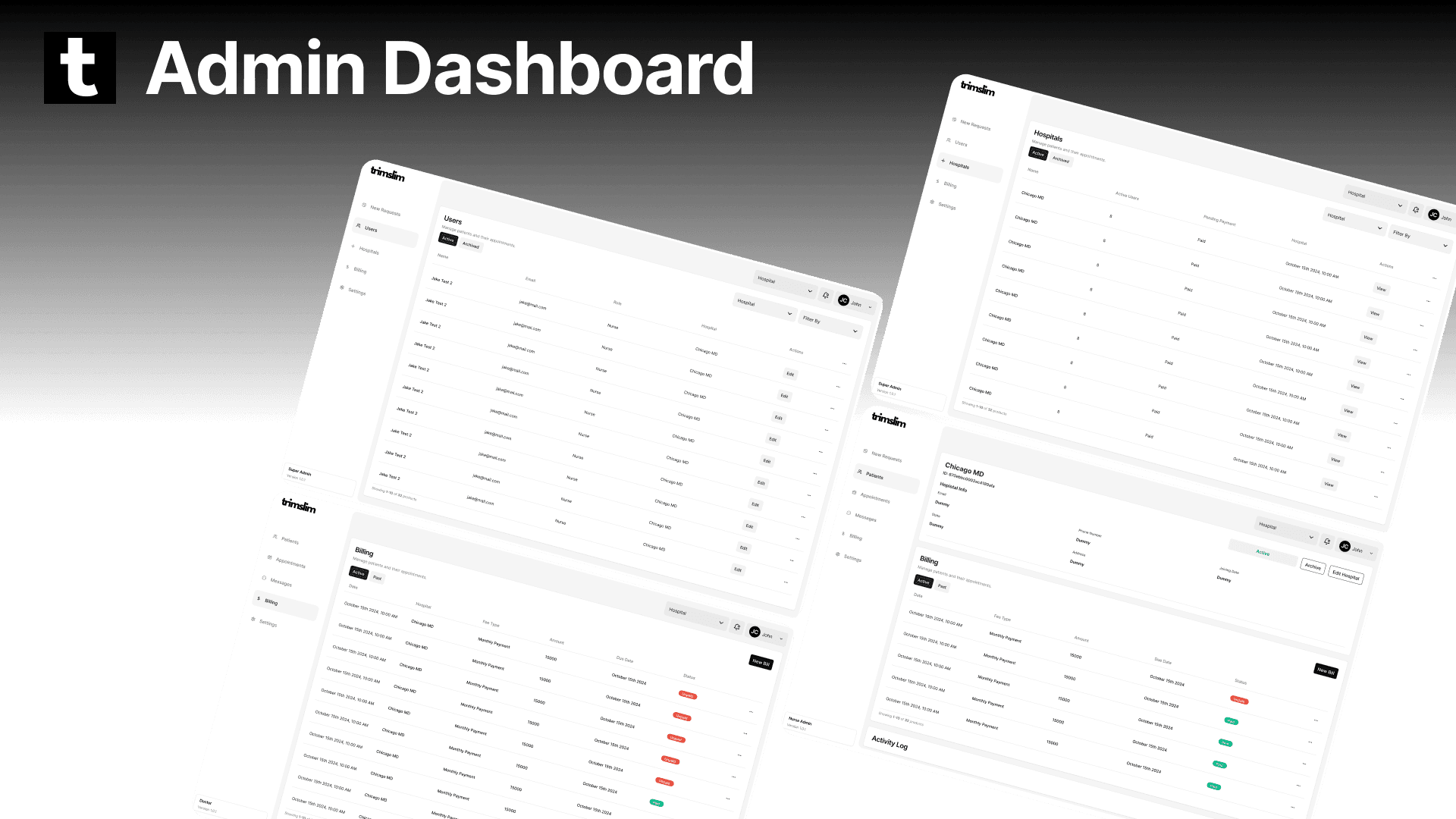
Admin Panel: User and provider management, partner and hospital management, platform-wide billing configuration and oversight.
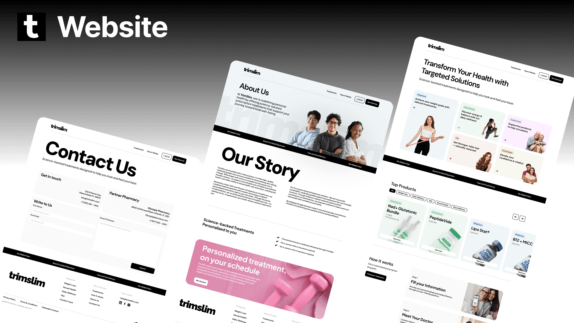
Redesigned Marketing Website: Colour-coded service navigation allowing direct service entry from the landing page. Expanded brand messaging covering all five services. Refreshed visual identity system applied across the full site.
Updated Nurse, Doctor, and Patient interfaces with service context indicators across all five categories.



Outcome and Impact
The portal functional UX from Phase 1 is live at trimslim.com. The complete multi-service visual redesign from Phase 2 is design-complete and ready for client-side implementation. Both phases are deliverables of this engagement. The original portal remains live while the full replacement awaits implementation.
Reflection
The most important decision on TrimSlim was made before any screen was drawn: the decision to use patient status as the shared vocabulary across all four roles. When three different people (nurse, doctor, patient) interact with the same record, the status model has to be exact — complete enough to convey clinical meaning, simple enough for a patient with no medical background to understand what it means for them. Getting that shared vocabulary right in the discovery phase saved significant iteration time across every interface that followed. Design the model first. Then design the screens.
Disclaimer: The project discussed herein was undertaken as a part of the Tech Goes Global team. The rights to this project are jointly owned by the client and the studio. This case study is presented solely to showcase my individual contributions to the project.