Social Media Marketing
Live at skyhyre.com | 21 jobs, 63 candidates, 11 recruiters in early access
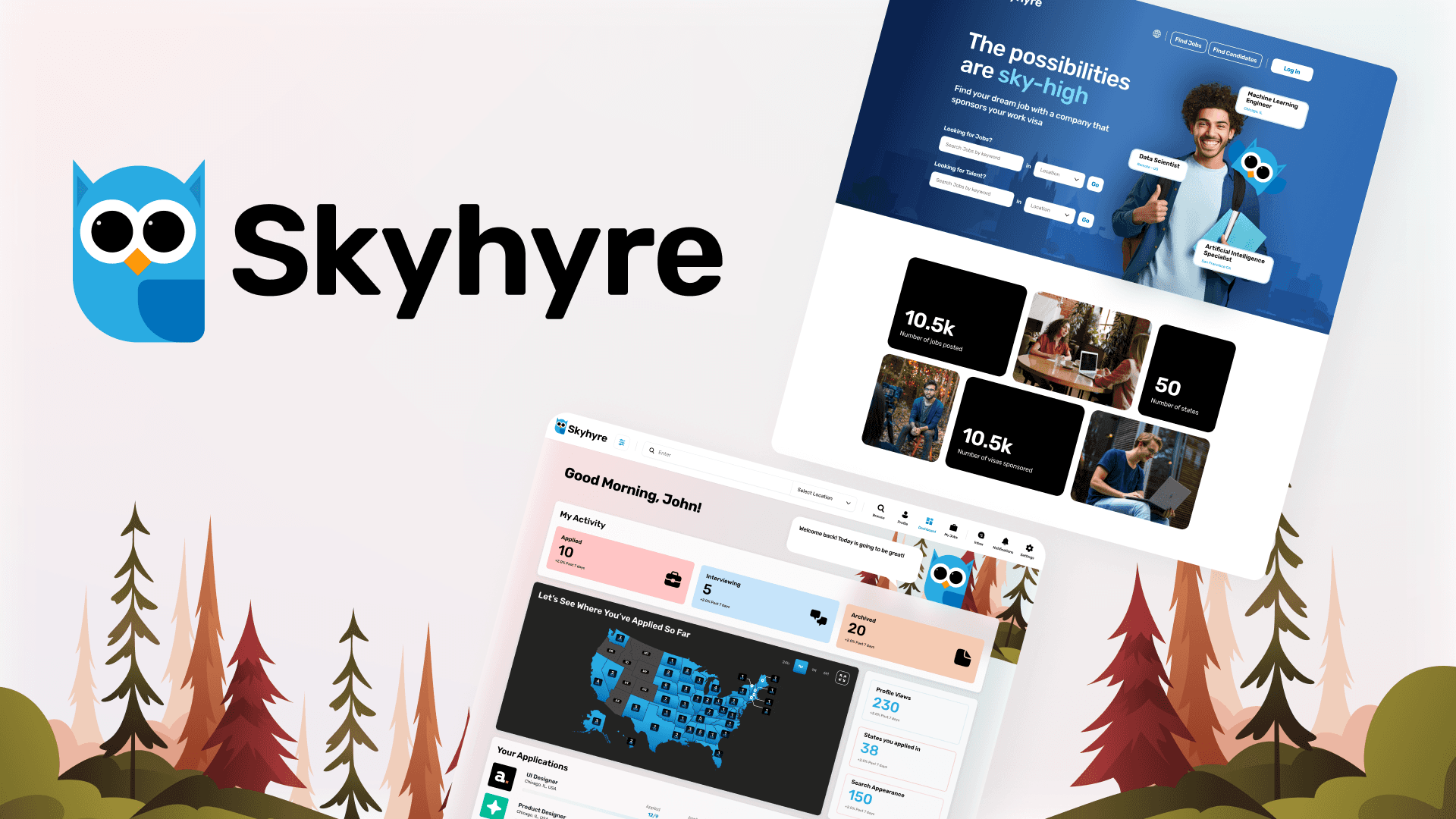
Overview
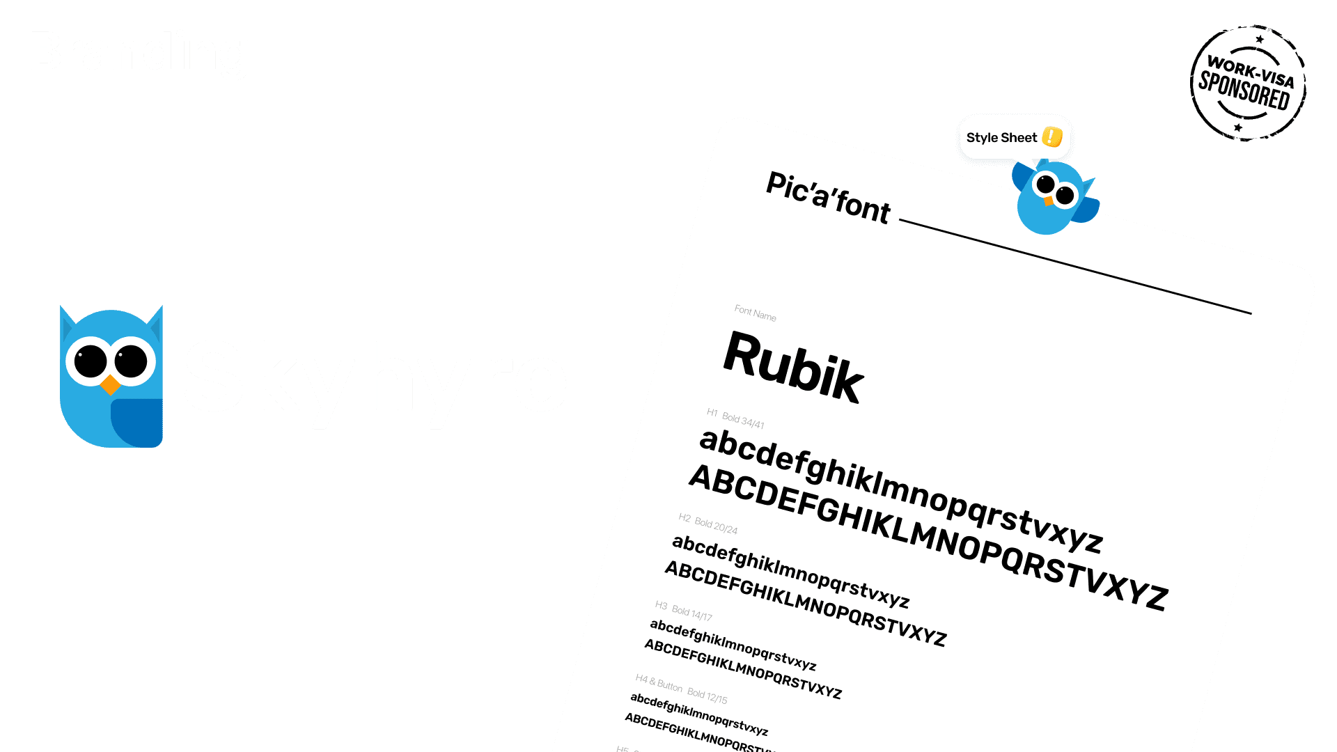
My Role: Lead Designer — Branding, User Flows, Wireframing, UI Design, Prototyping, Social Media Guidelines
Platform: Web application (job seeker app, recruiter app), marketing website
Timeline: 1-month MVP Status: Live, in review for UX improvements and additional features
Live link: skyhyre.com
Early access data: 21 job postings, 63 registered candidates, 11 active recruiters
Context
Skyhyre is a US-based web SaaS platform that connects international job seekers requiring visa sponsorship with employers willing to sponsor. It operates as two separate web applications — a job seeker app and a recruiter app — accessed from a shared marketing website where users sign up and self-identify their type. The product was designed to be the dedicated destination for a niche that generic job platforms consistently underserved.
The Problem
International candidates seeking US visa sponsorship have no dedicated platform. Generic job boards bury sponsorship details inside full job descriptions, requiring candidates to read every posting to determine basic eligibility. No platform showed geographic distribution of sponsoring employers — a critical first question for visa candidates who need to know which states are even sponsoring. For recruiters, no tool gave geographic insight into where their visa-sponsored postings were attracting candidate interest.
The specific design problem: the primary user question is geographic before it is keyword-based. Job discovery for this audience needed to start with a map, not a search bar.
My Role and Constraints
I was the lead and only designer on Skyhyre from zero to shipped. I owned all branding, the job seeker web app, the recruiter web app, the marketing website, and social media brand guidelines. The central design constraint was building a job discovery experience around a geographic interface while ensuring candidates who prefer keyword search were not penalized. Both mental models had to be served from the same surface.
Research and Discovery
I researched the job search experience for international candidates on LinkedIn, Indeed, and H1B-focused aggregators including MyVisaJobs.com. Key findings: sponsorship clarity was missing at the job card level on every platform, and no platform showed geographic distribution of sponsoring employers. I also researched map-based discovery interfaces in adjacent contexts (Airbnb, Realtor.com) to understand the established conventions for map-plus-list hybrid patterns. The most effective implementations kept the map and list in constant sync — clicking a map marker updated the list, and hovering a list item highlighted the corresponding map pin.

Key Design Decisions
Decision 1: Map as primary discovery, list as secondary
The map view shows job count by US state. Clicking a state opens the list view filtered for that state, with the map remaining visible. The map answers the geographic question first; the list answers the role-specific question second. Critically, jobs can be posted as standard Skyhyre applications or as external application links (redirecting to the company's own site). Both types appear on the map, maintaining geographic coverage regardless of where the application is completed.
Decision 2: Recruiter pipeline management as a first-class feature
Recruiters can save job seekers to named pipeline groups visible only to them. The same candidate can appear in multiple pipelines simultaneously without the candidate being aware. This mirrors how sophisticated recruiters actually work: they maintain separate shortlists per open role and manage candidates across multiple positions. Designing this as an organizable named pipeline elevated it from a bookmarking feature to a genuine recruiting workflow tool.
Decision 3: Asymmetric messaging by design
Job seekers can only receive and reply to messages from recruiters — they cannot initiate. Recruiters can initiate messages with any candidate. This asymmetry protects the platform from becoming a spam channel, gives recruiters the outreach capability they need, and incentivises job seekers to build strong searchable profiles. Both messaging interfaces were designed to reflect this asymmetry clearly without making it feel punitive for candidates.
The Solution
Skyhyre delivers two purpose-built web applications.
Job Seeker App: Map-based job discovery with state-level clustering and list sync. Job detail panel with sponsorship type displayed prominently. Application flow with profile pre-fill and company question support. Applicant dashboard with activity tracking and application history map. Profile management with resume upload. Inbox for recruiter-initiated conversations with reply capability.
Recruiter App: Talent browse and filter with candidate profile views. Named pipeline groups privately managed and candidate-invisible. Map view of posted jobs and applicant geographic distribution. Job posting flow with standard Skyhyre application or external redirect options. Recruiter dashboard with geographic job overview and pipeline list. Candidate messaging with initiation capability.
Marketing Website: Landing page with CTAs, product overview for both user types, login access for existing users.
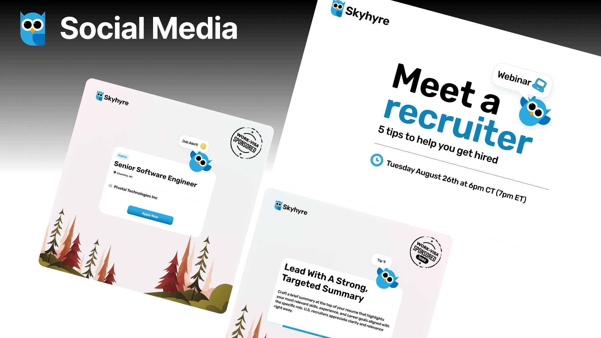
Social media brand guidelines also delivered for ongoing platform marketing.


Outcome and Impact
Skyhyre is live at skyhyre.com in early access: 21 active job postings, 63 registered candidates, 11 active recruiters. The platform is in active review for UX improvements and feature additions based on early user behavior.
What is coming next:
The product is currently in active review for UX improvements and for planned additional features
Reflection
The map-first decision was a product decision before it was a UX decision. It repositioned Skyhyre around a user question that no competitor had answered geographically. The risk was unfamiliarity for users conditioned to keyword-first search. The mitigation was ensuring search was always accessible from the map view, serving both mental models. Early user behaviour will confirm which surface is used more. That data should drive V2 prioritisation — not assumption.
Disclaimer: The project discussed herein was undertaken as a part of the Tech Goes Global team. The rights to this project are jointly owned by the client and the studio. This case study is presented solely to showcase my individual contributions to the project.