Web App
Dashboard
Design complete | Internal project, shelved to prioritise client work
My Role: Lead Designer — Naming, Branding, User Flows, Wireframing, UI Design (Light and Dark), Prototyping
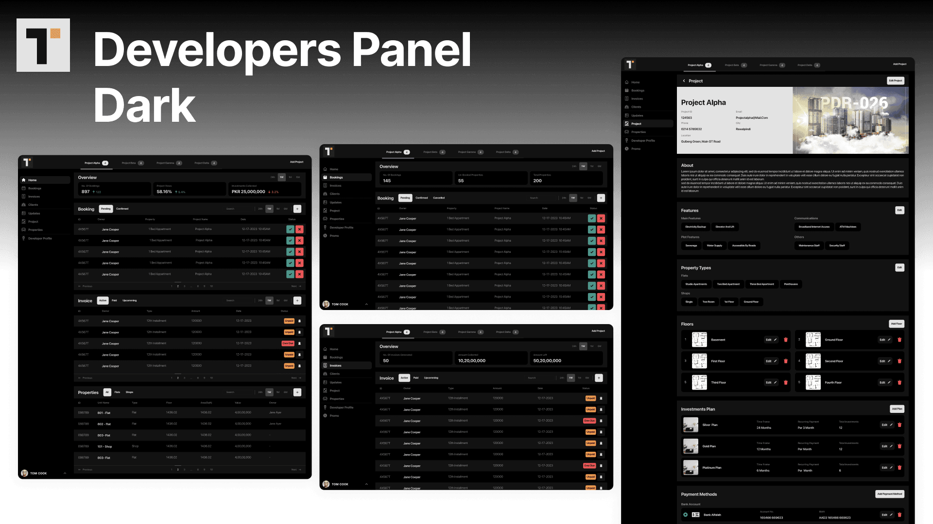
Platform: iOS and Android mobile app, property dealer web panel, super admin web panel
Timeline: Concept to dev-ready in a focused sprint
Status: Design-complete. Shelved internally to prioritise client work. Not developed.
Company: Code Experts (internal project)
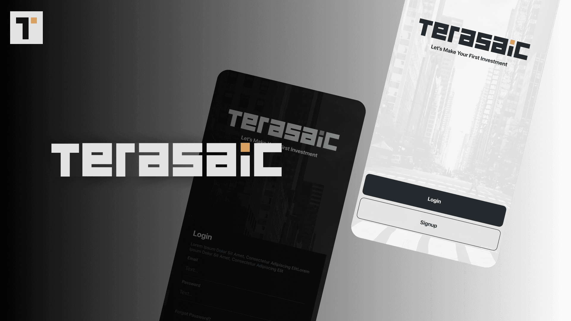
Note: The product had no name internally. I named it Terasaic and created all branding for portfolio purposes.
Context
Terasaic was an internal concept by the Code Experts director: a mobile-first real estate investment platform that would let users discover, evaluate, reserve, and complete property investment transactions from their phone. The vision was to make property investment as frictionless as booking a flight. I worked directly with the director from the initial concept brief through to a dev-ready design handoff.
The Problem
Traditional real estate investment required physical visits, manual paperwork, broker intermediaries, and multi-week transaction timelines. Digital platforms existed for property browsing (Bayut, Zameen, Zillow) but none provided a full investment transaction flow in a mobile-first context. The specific challenge: property investment involves financial transactions at a scale where users need to feel trust and security in the interface before they commit. Design language carries real commercial weight in this context.
My Role and Constraints
I was the lead and only designer on Terasaic. I named the project, created all branding, and designed the complete mobile app (light and dark modes), the property dealer management panel, and the super admin oversight panel. The primary constraint was working with a director's vision rather than an established brief, which required regular alignment sessions to ensure design decisions matched the product concept as it evolved in the director's thinking.
Research and Discovery
I researched property investment platforms across three markets (Pakistan, UAE, UK) to understand transaction flows and trust signals in digital real estate. Key finding: the highest drop-off in digital property platforms occurs at the reservation and payment stage because users lose confidence in the platform's legitimacy at the moment of financial commitment. The design language had to front-load credibility signals before the user reached any payment screen.
I also studied fintech investment apps (Robinhood, eToro, Wealthsimple) for interaction conventions around financial commitment flows — how they communicated risk, confirmed transactions, and handled the emotional weight of a purchase decision.
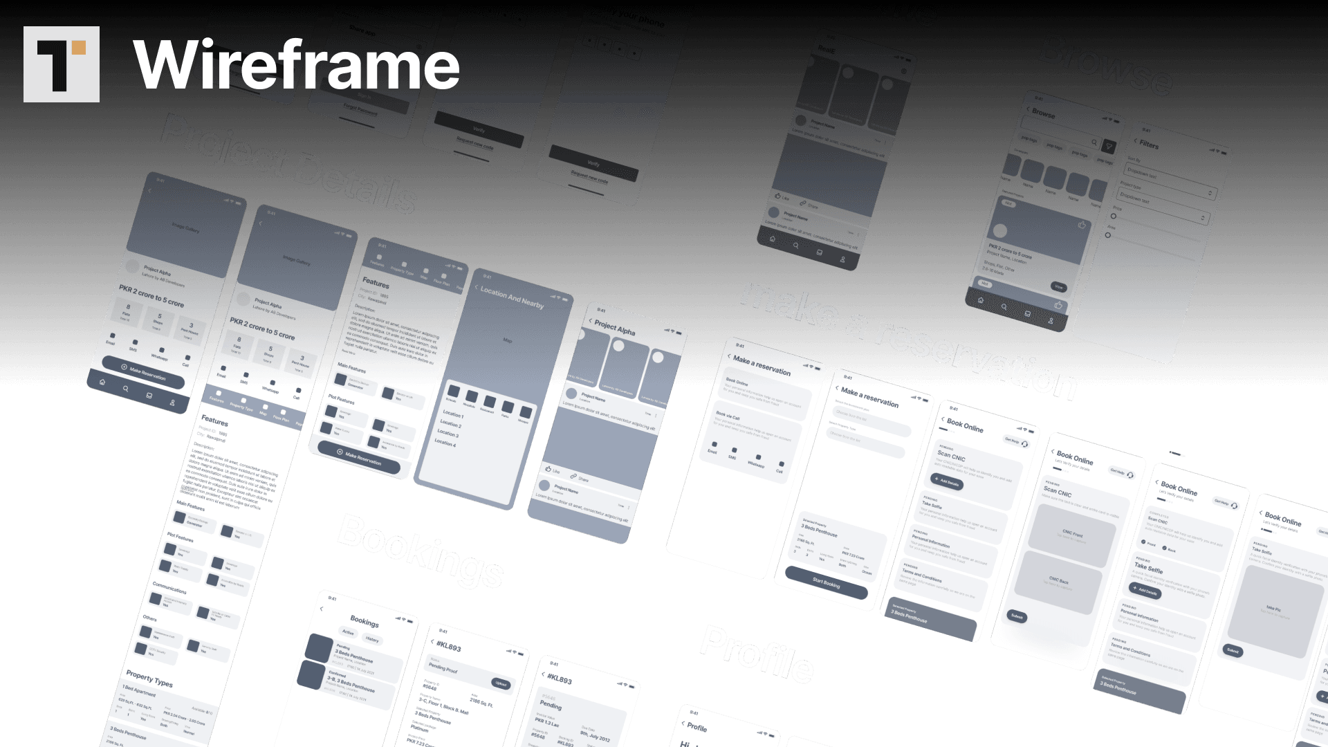
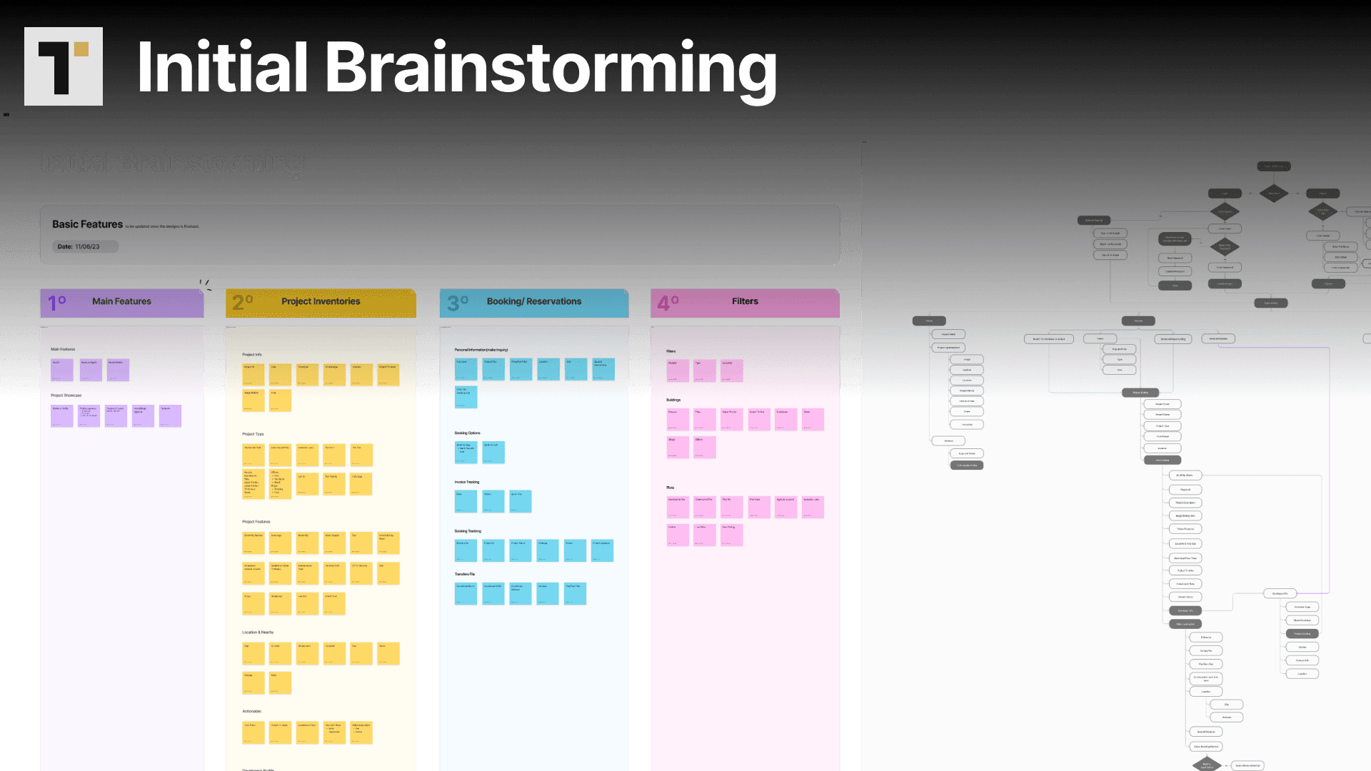
Key Design Decisions:
Decision 1: iOS design language as the primary reference
The initial mobile designs followed a more generic cross-platform approach. The director requested a switch to iOS-native conventions mid-engagement. Rather than patching the existing designs, I rebuilt the component library around iOS Human Interface Guidelines, which improved consistency and reduced the number of custom components needed. This was the right call: the target user in GCC markets has high iOS penetration.
Decision 2: Dual theme as a design system decision, not a visual afterthought
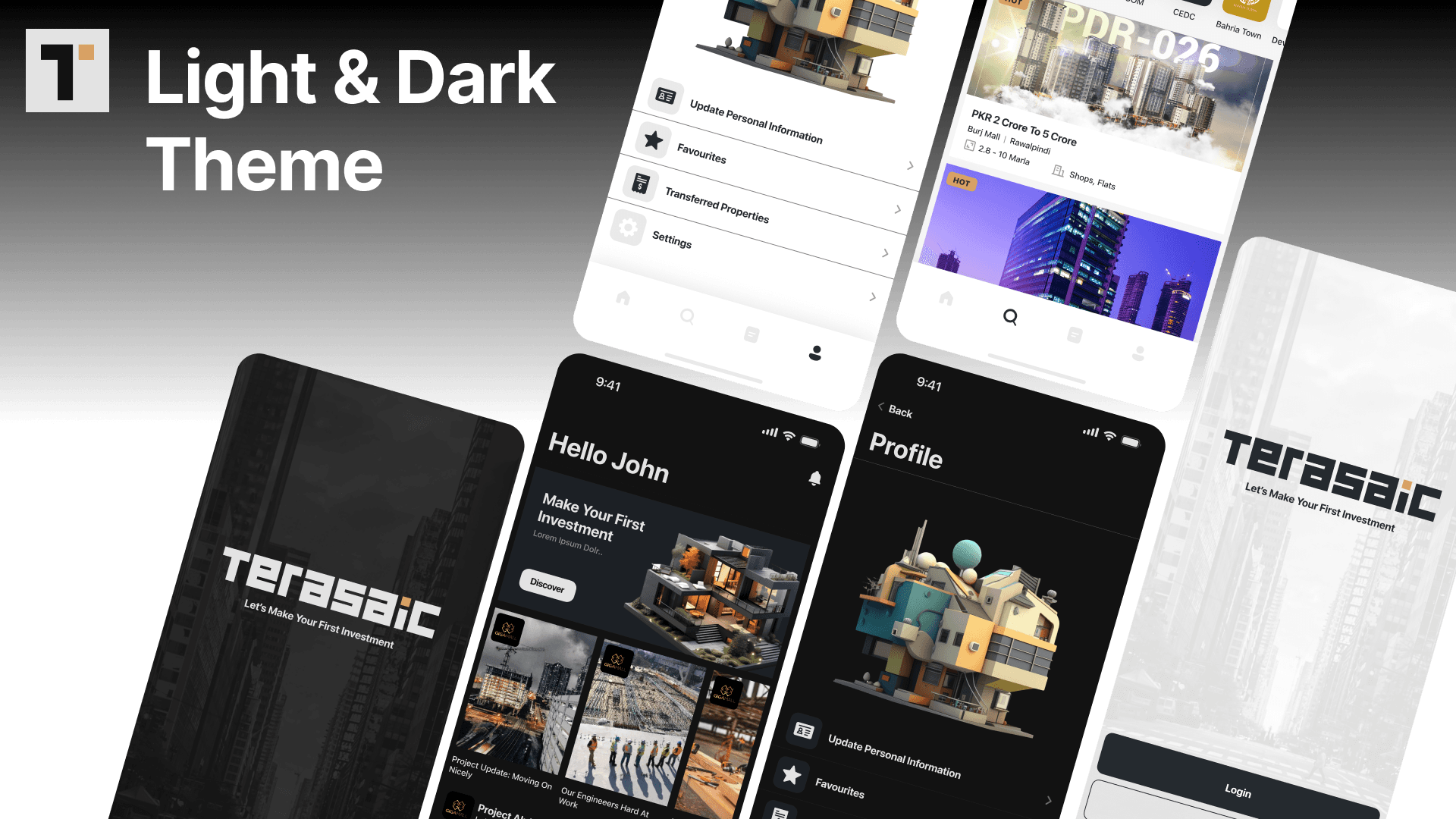
The light and dark mode requirement was addressed at the token level: I designed all colour decisions as semantic token pairs (background-primary: light value / dark value) rather than creating separate designs. This meant any UI change applied to both themes simultaneously. It also allowed the developer to implement theme switching without designer input on each component.
Decision 3: Property cards designed around investor information, not buyer information
Standard property platforms design cards around buyer information: photos, bedrooms, bathrooms, price. An investor needs different primary information: projected return, investment stage, lock-in period, availability of units. I redesigned the property card taxonomy around investment metrics as primary information and standard property details as secondary. This was the single most important content decision on the product.
The Solution
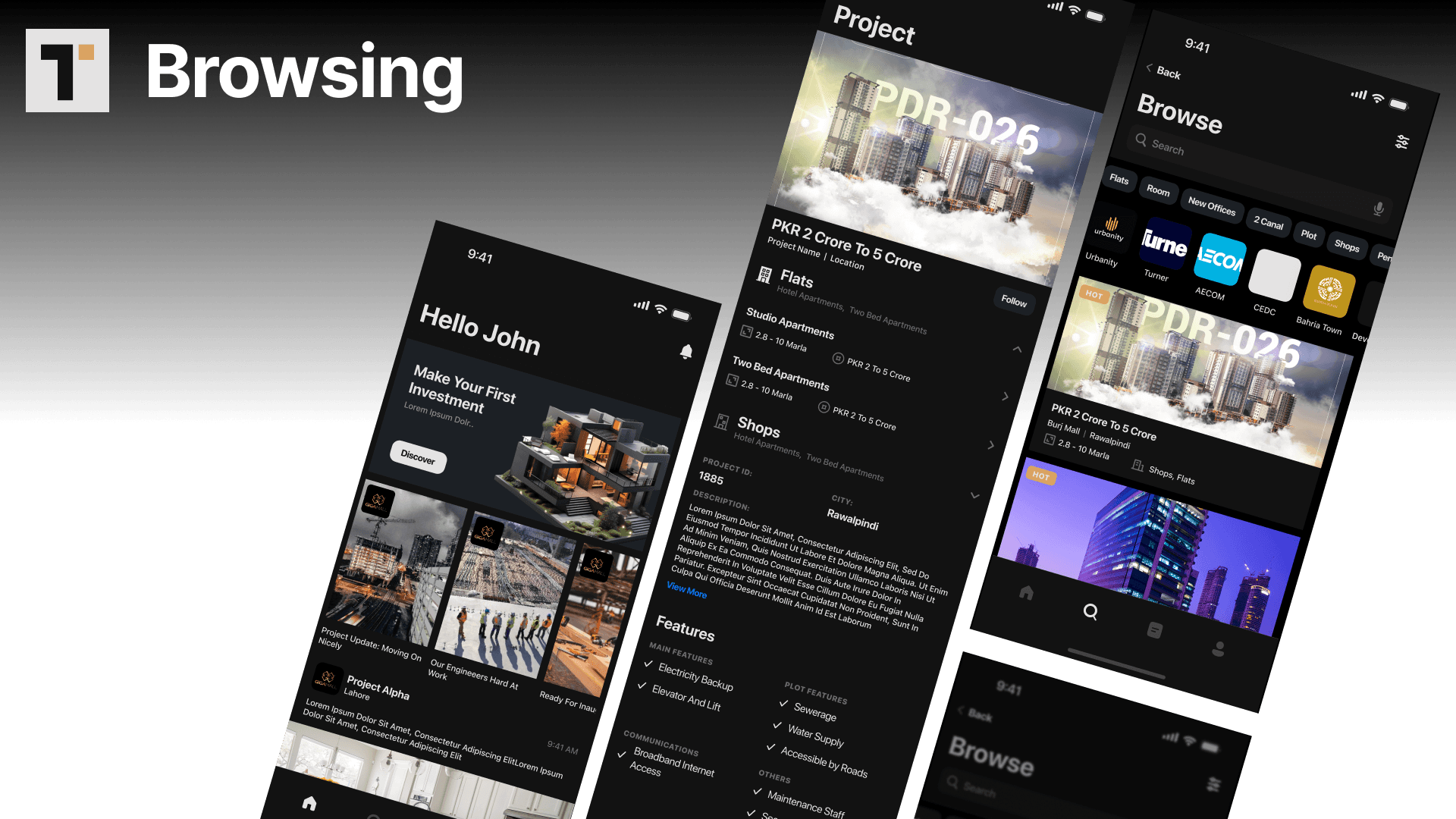
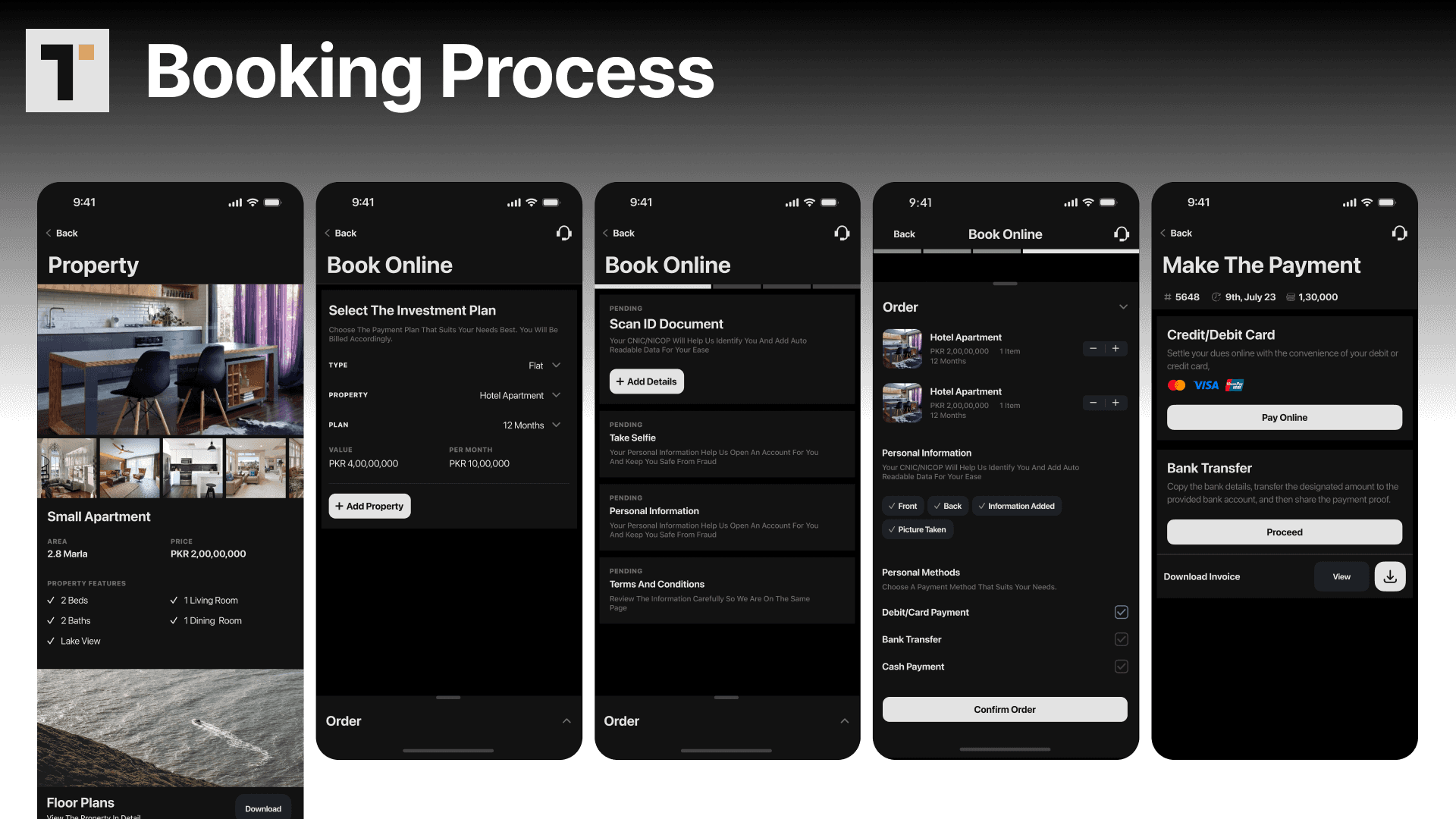
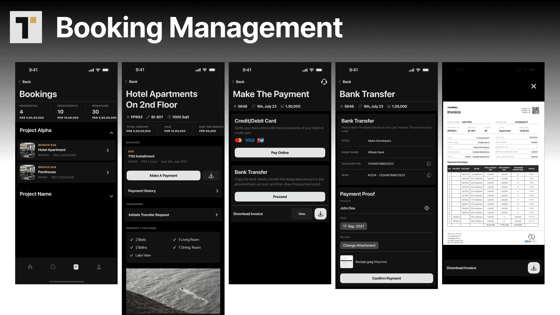
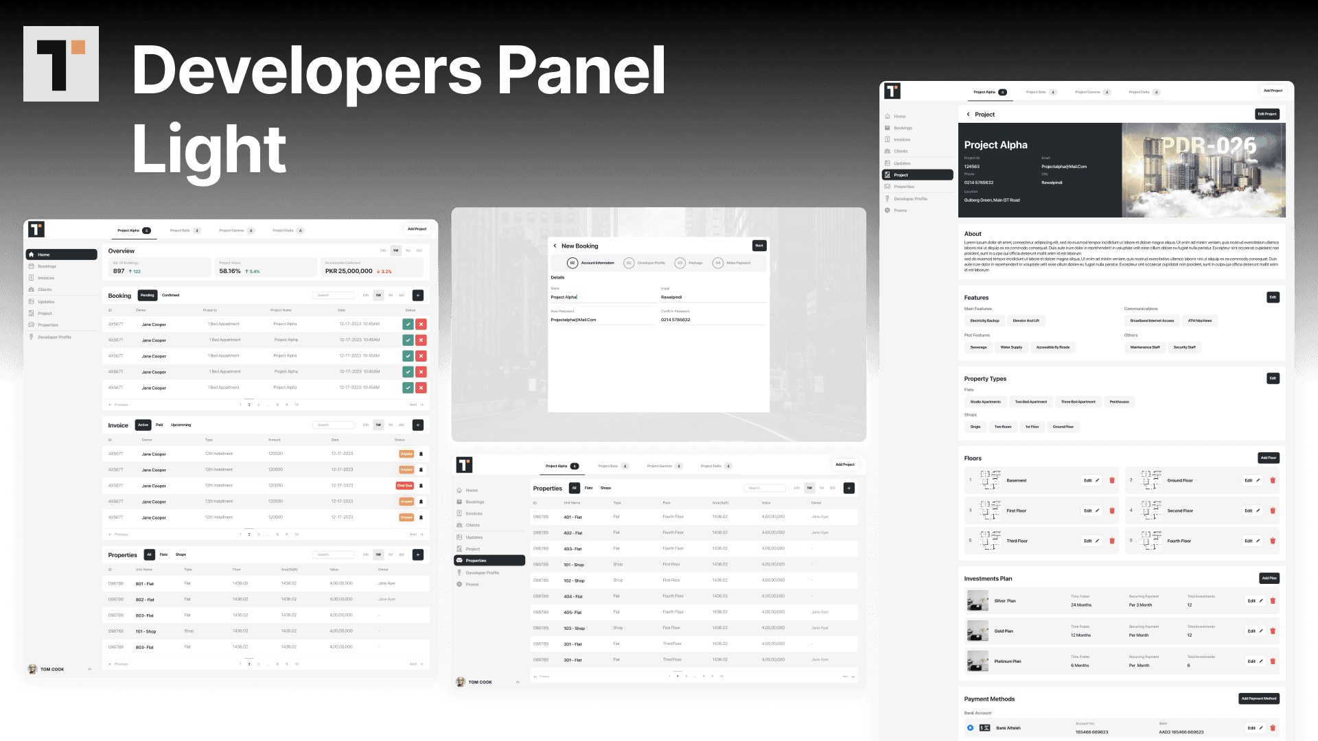
Terasaic is a mobile-first real estate investment platform covering discovery, evaluation, reservation, monitoring, and payment. The iOS app (light and dark) takes users from property browsing (filtered by investment type, return rate, location, and availability) through a reservation flow with investment tier selection to a secure payment completion and portfolio monitoring view. The property dealer web panel allows dealers to list, update, and monitor investment properties. The super admin panel provides platform-wide oversight, compliance monitoring, and user management.
Outcome and Impact
Terasaic was delivered as a complete dev-ready design system covering light and dark mode mobile app, dealer panel, and super admin panel. The project was shelved to prioritise client work — a common outcome for internal projects at agencies. The design system and brand identity were developed to production quality and are available in the portfolio at full fidelity.
Reflection
Naming and branding a product that the client had not yet named is an unusual creative position. It gave me full creative freedom but also full creative responsibility: if the name or brand does not work, there is no prior decision to reference. Terasaic emerged from terrace and mosaic, evoking the visual language of tiled property development. The iOS shift mid-engagement was a learning in scope management: a platform switch should be treated as a phase restart, not an update. I rebuilt the component library rather than patching it, which was the right call and the right lesson.
Disclaimer: The project discussed herein was undertaken as a part of the Code Experts team. The rights to this project are jointly owned by the client and the studio. This case study is presented solely to showcase my individual contributions to the project.