Social Media Marketing
Shipped | Canadian market | Clients including NLE Choppa and 10+ Clients deployments | Limited Study
My Role: UX Contributor — User Flows, Wireframing, UI Design, Prototyping, Per-Client Branded Asset Production (under senior design direction)
Tool: Adobe XD (2020-era engagement, prior to Design Tokens becoming standard in XD workflows)
Platform: iOS and Android white-label mobile app
Target Market: Canadian creator communities Clients: NLE Choppa, Inspired Mommy and more
Timeline: Full design engagement at Little Studio
Status: Shipped, first went live in 2020
Note: A high-level summary of the project is presented here to comply with confidentiality requirements
Context
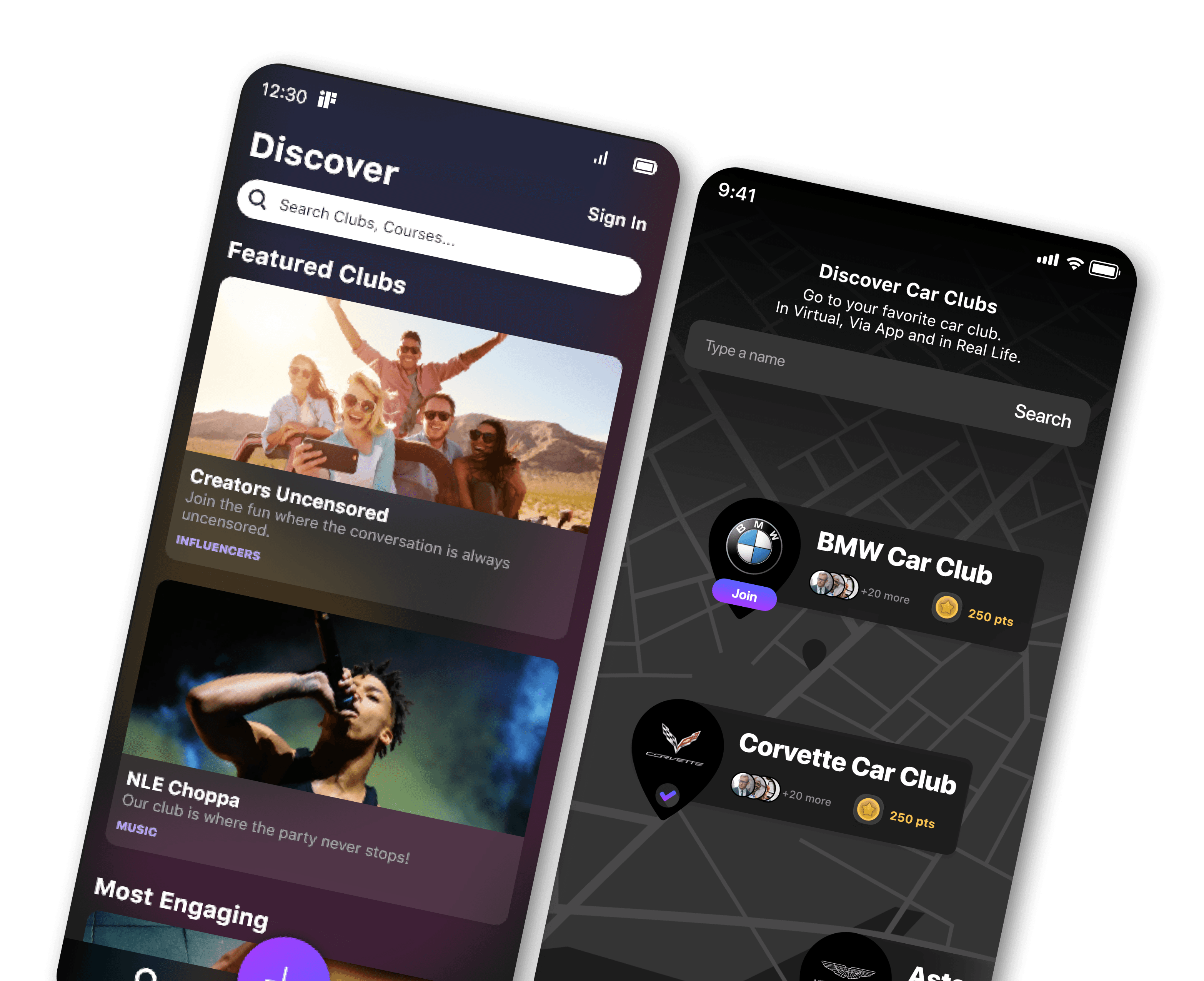
Clubify is a white-label mobile platform built on a patented system that lets creators, brands, and organisations build exclusive membership communities where fans and followers can access content, events, courses, and merchandise — and pay for it. The platform's core concept: social media gives away creator content for free while the platform captures all the value. Clubify lets creators own their community and monetize it directly.
The original Clubify was incomplete and had a generic one-size-fits-all interface. This engagement was a comprehensive redesign focused on building a system that could be branded per client while maintaining UX consistency across all deployments.
The key structural note: the main app has universal functionality. When a creator sets up their club, they choose which features to activate or deactivate. The branding and any additional screens (like store screens specific to a client) are then applied on top of the activated feature set. 10+ companies received customized branded assets across the platform.
On tools: This was built in Adobe XD in the early 2020s, before Design Tokens were a practical workflow in XD. Where a token-based system would now handle brand switching automatically, we applied branding manually per client — updating colors, typography, and assets per deployment. A token architecture is the correct approach today and would significantly reduce the manual work per client. At the time, the manual approach was the right one for the tools available.
The Problem
The original Clubify was incomplete and gave all club owners the same interface regardless of their brand identity. A hip-hop artist's community and a tennis club's community look nothing alike in real life. When both deploy the same generic platform, neither feels truly owned by the creator. Members can tell they are on a generic platform rather than their creator's own space, which undermines the exclusivity the product promises as its core value.
The design problem: how do you build one system that can feel completely different for NLE Choppa and a Tennis Club, while remaining coherent and maintainable underneath?
My Role and Constraints
I was a UX contributor on Clubify under senior design direction at Little Studio. My contribution covered user flows, wireframing, UI design across 22 screen types, prototyping, per-client branded asset production (onboarding screens, App Store and Google Play listings per client), and iterative design updates for each new client deployment. The constraint was designing a system flexible enough to accommodate widely different brand identities while maintaining UX consistency underneath — without a token system to automate brand switching.
Research and Discovery
Research covered three areas: creator economy monetisation platforms (Patreon, Substack, OnlyFans), community app design conventions (Discord, Geneva, Telegram), and the specific client roster to understand the visual language each creator type would require.
The core finding: platforms that retained creator loyalty were those that made the creator feel like the platform belonged to them. Design customisation depth directly correlated with creator retention. The white-label system was not a feature — it was the business model's core product requirement.
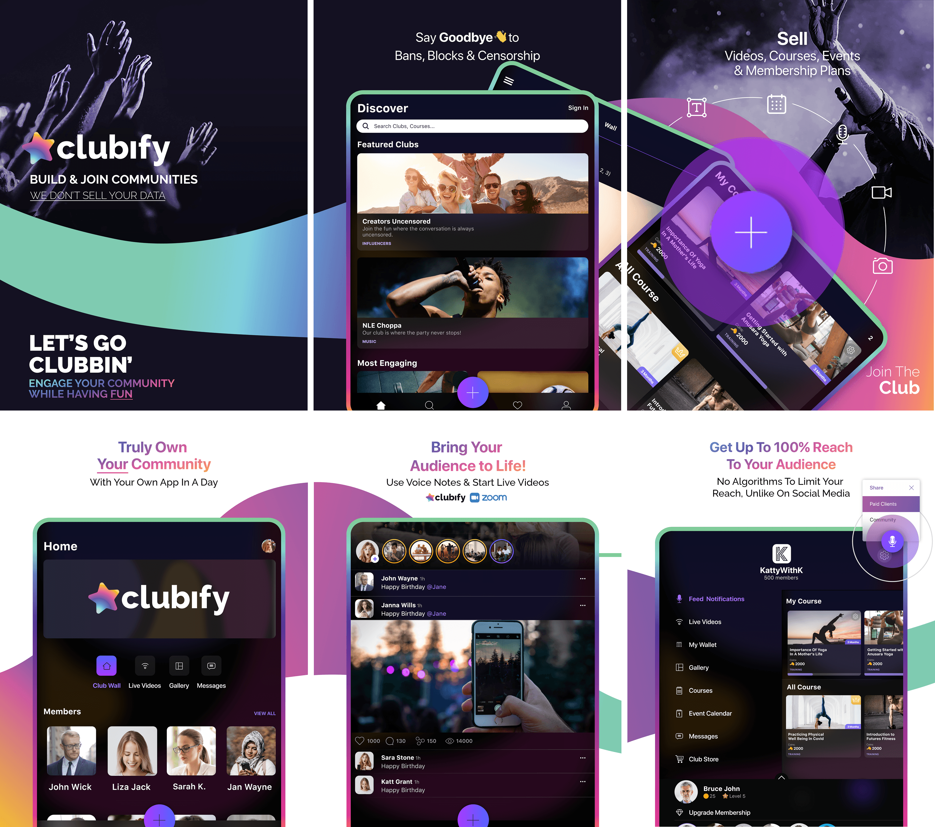
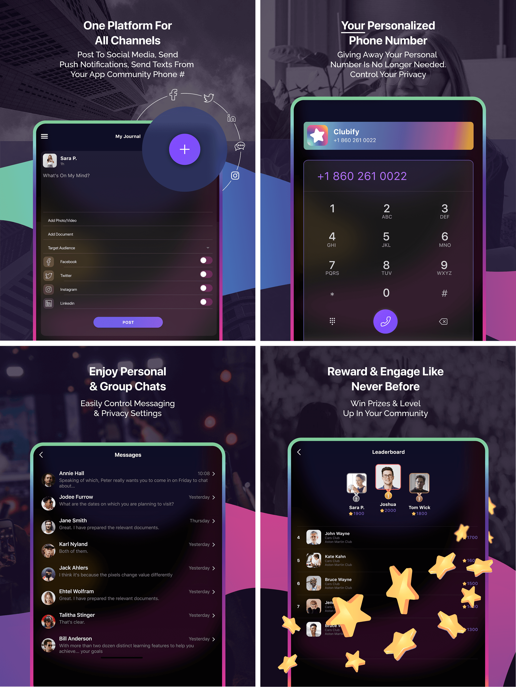
Decision 1: 22 screen types as a complete system, not individual screens
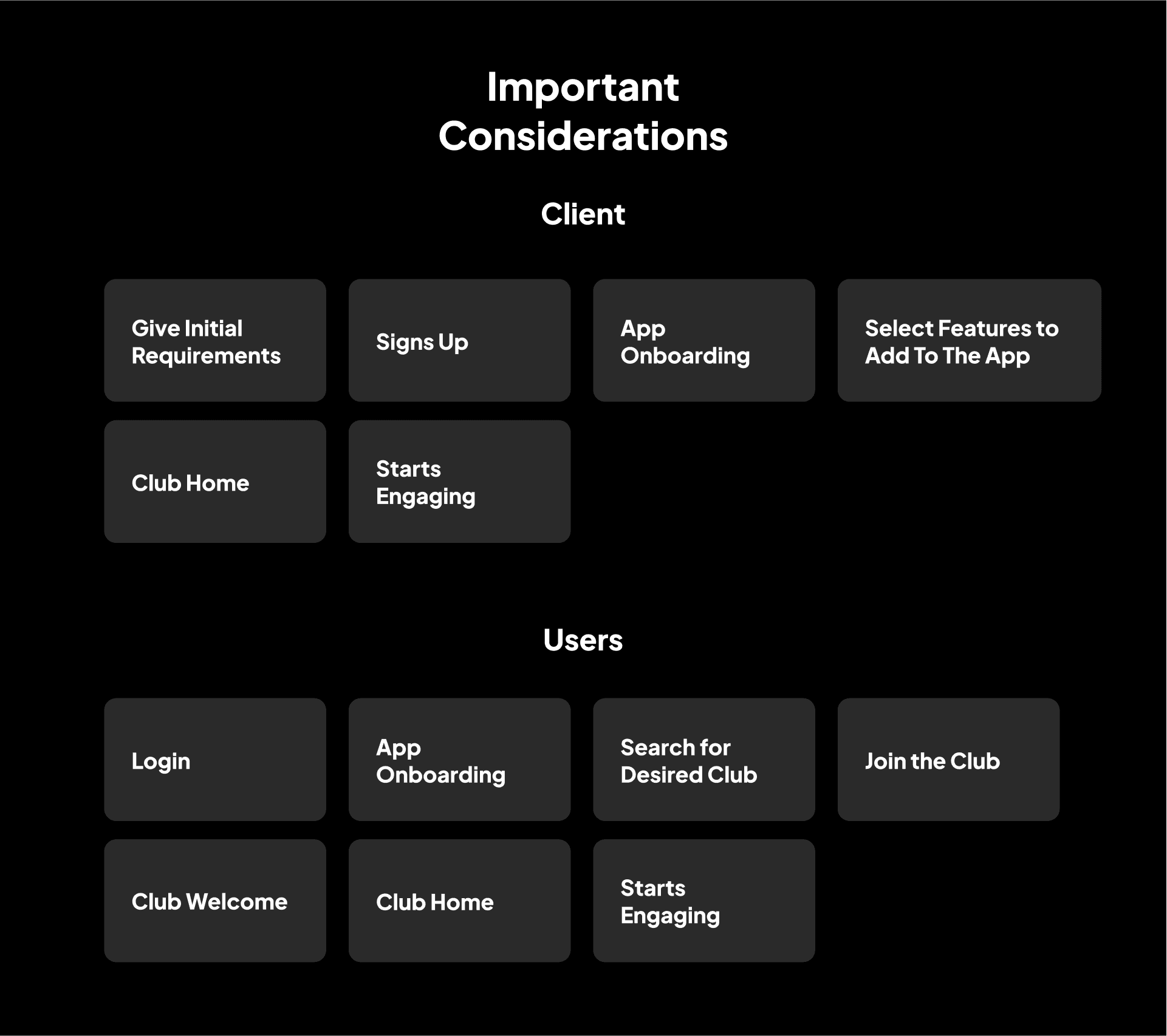
Every screen was designed as part of a coherent system rather than in isolation. This meant onboarding flows led coherently to home states, which connected to club exploration, content views, payment flows, and community features. The 22 screen types represent unique interaction patterns, each with multiple states, not individual isolated screens.
Decision 2: Per-client branding applied manually with systematic rigour
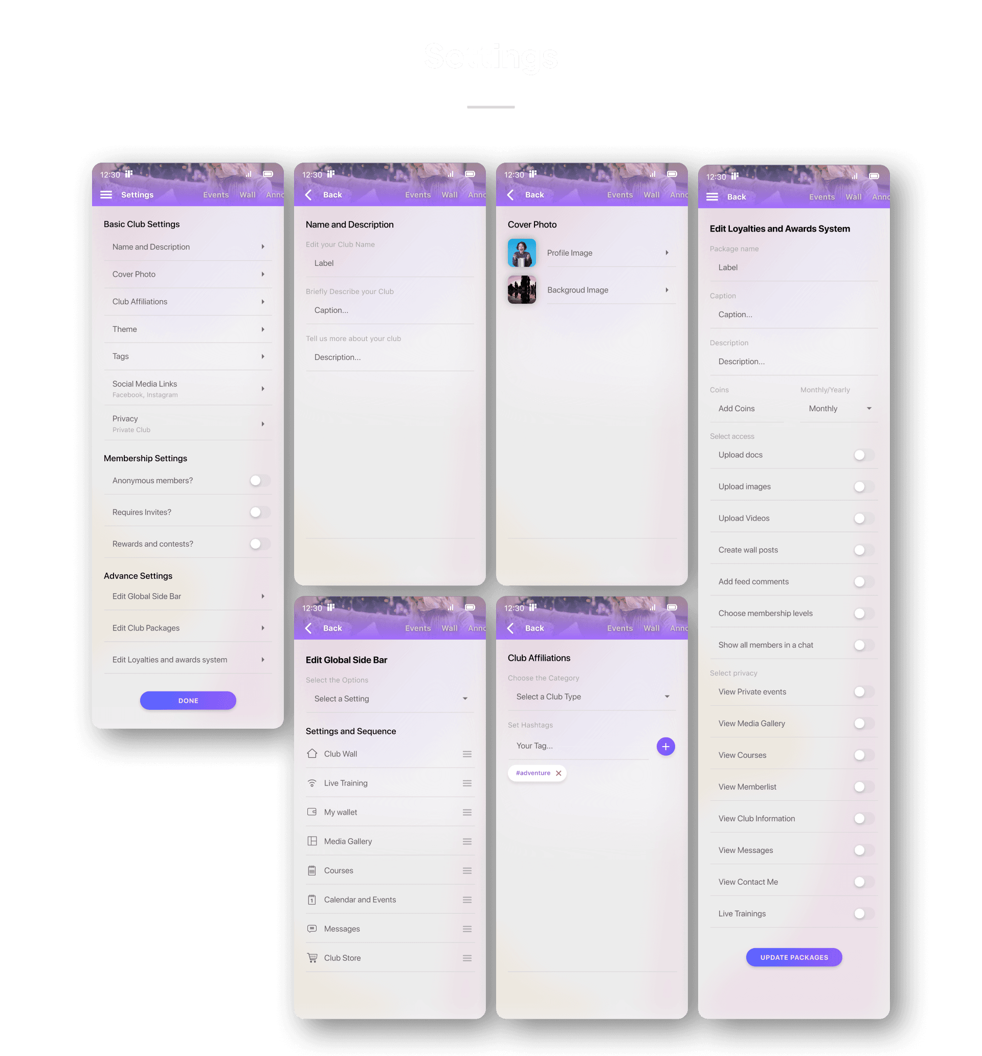
Without a token system in Adobe XD at the time, branding was applied manually per client. This required developing a rigorous handoff process: a master file with all 22 screen types, a layer-naming convention that made color and typography replacement predictable, and a checklist-based review process per client deployment to catch missed elements. The manual system produced the same output quality that a token system would produce automatically — it just required discipline rather than tooling.
Decision 3: Content type prominence configurable per creator type
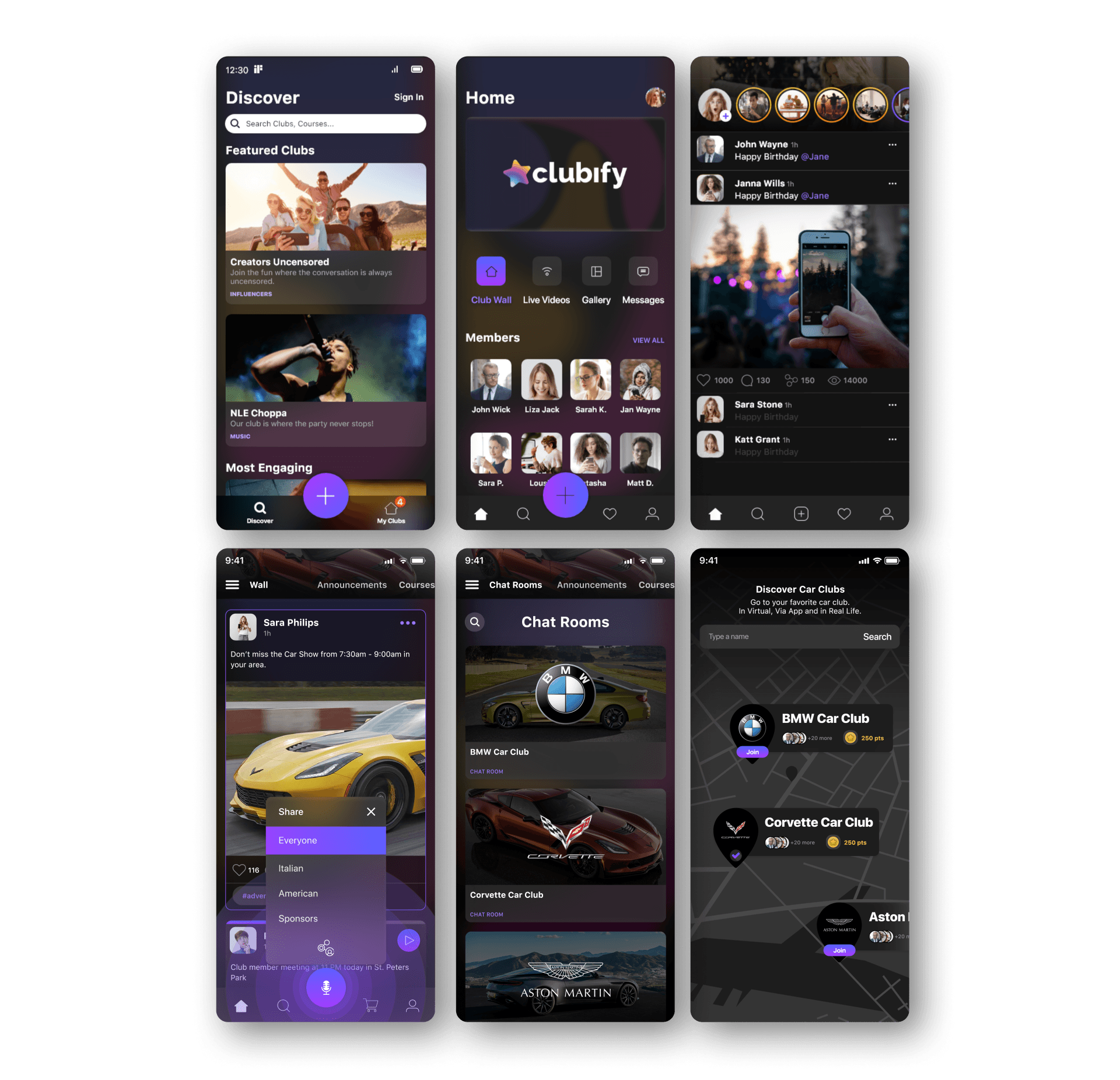
A music artist's club surfaces live content and events prominently. A fitness influencer's club surfaces courses and goals. An educational creator's club surfaces structured courses and private sessions. We designed content type prominence as a configurable hierarchy within the navigation system — the same navigation structure could weight content types differently per client by reordering the tab bar and home feed sections. This required designing all content types as equally capable of being primary or secondary, not hardcoding any one type as the lead.
The Solution
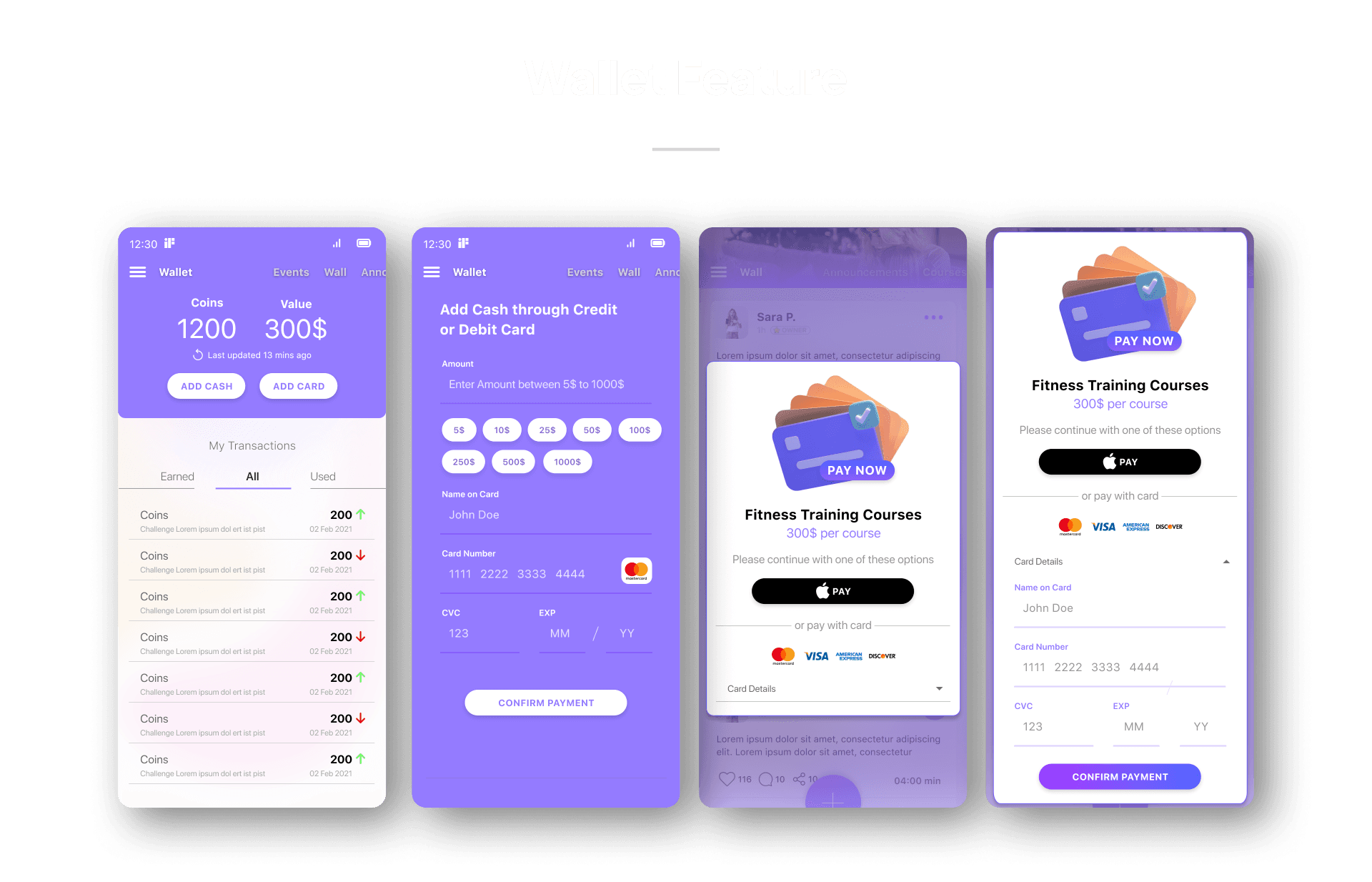
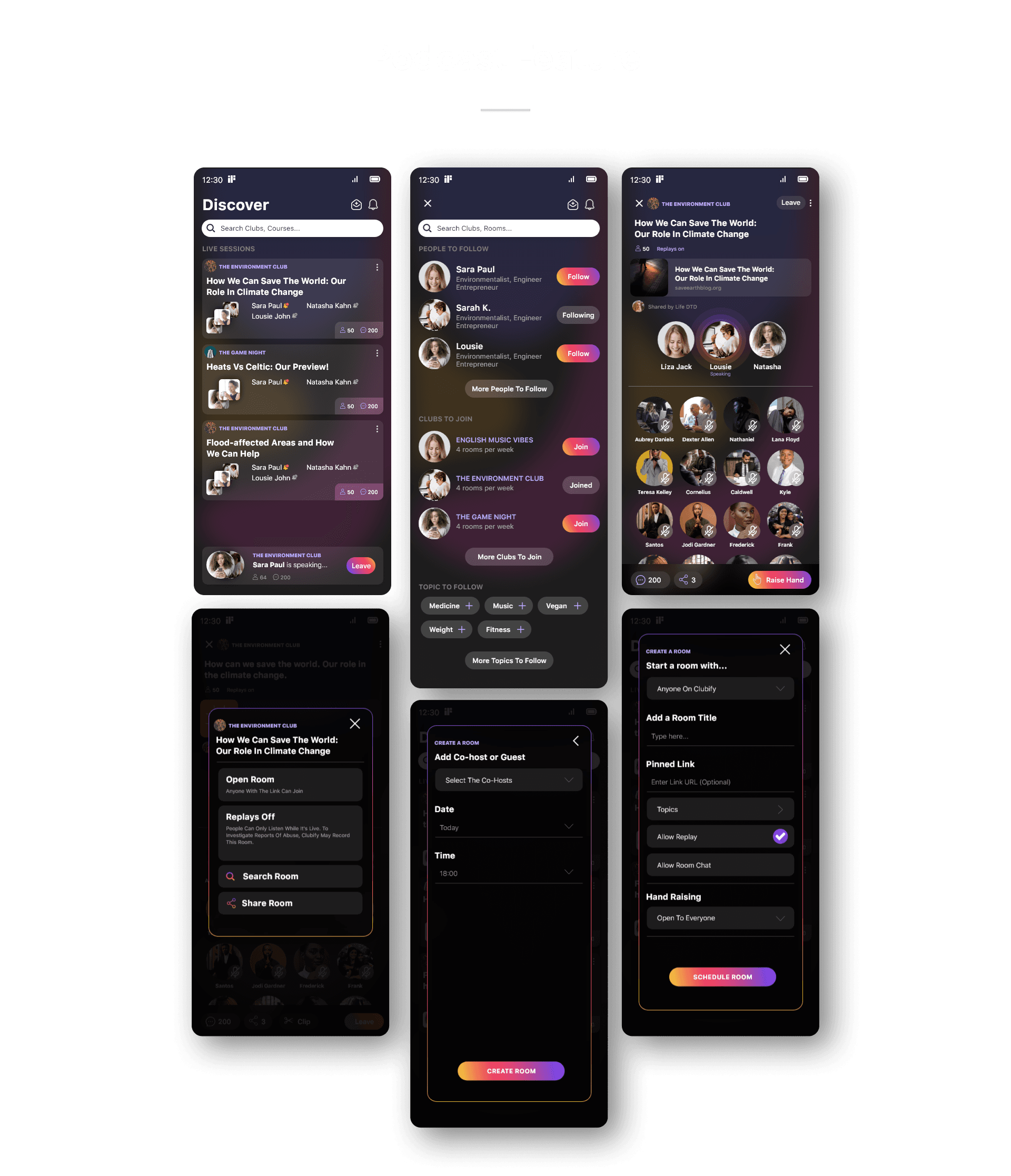
The redesigned Clubify delivers a fully configurable white-label membership platform. The 22 screen types cover: Onboarding, Login, Discover Clubs, My Club, Add Post, Live Podcasts, Auctions, Calendars, Events, Club Goals, Club Journey, Courses, Invites, Leaderboards, Live Meeting, Gallery, Members, Messages, Chat Rooms, Profile, Settings, Store, and Wallet. Each screen is a component in the design system that receives per-client branding via manual application of the brand token set. Client-specific onboarding and App Store or Google Play listing assets were produced for each deployment. 10+ companies received fully branded versions of the platform.
Outcome and Impact
The redesigned Clubify was shipped for the Canadian market with client deployments including NLE Choppa, Tennis Club, Inspired Mommy, and 7+ additional companies. The design system successfully enabled brand differentiation across 10+ clients. The platform's combined client base reached 250K+ followers across creator communities.
Reflection:
White-label design is a systems problem before it is a visual problem. The correct question is never "what should this screen look like?" It is "what rules produce the correct screen for any client?" Building those rules without a token system required a different kind of rigor — naming conventions, master files, per-client checklists. The manual work reinforced why Design Tokens exist. A system that required checklist discipline to maintain consistently is a system that would benefit from automation. Today I would build this with a token architecture from day one. In 2020, the discipline approach was the right answer for the tools available.
Disclaimer: The project discussed herein was undertaken as a part of the Little Studio team. The rights to this project are jointly owned by the client and the studio. This case study is presented solely to showcase my individual contributions to the project.