Design complete | Not developed | 1-month engagement

My Role: Designer — Branding and Logo Design, User Flows, Wireframing, UI Design, Prototyping
Platform: Mobile-First Website (primary ordering experience), marketing website, manager panel, point of sale system
Timeline: 1-month engagement
Status: Design complete. Not developed.
Context note: This was a design-ready engagement. The product was not developed. The design thinking and system are presented as the deliverable.
Context
Recaff was an online coffee shop concept designed specifically for university students who needed a faster way to order coffee between classes. The primary product was a mobile web ordering experience designed to minimise the time between "I want coffee" and "my coffee is ready". The secondary deliverables were a marketing website establishing the brand, a point of sale system for baristas, and a manager panel for branch management across a campus or multi-campus operation.
The Problem
University students have 10 to 15 minute windows between lectures. A standard coffee shop ordering experience (physical queue, menu board overhead, verbal order, wait) typically takes 5 to 12 minutes. That is the entire break. The Recaff brief was specific: design an ordering experience that a student could complete in under 2 minutes from phone to confirmed order, with the coffee ready on arrival. The secondary problem: most campus coffee operations were managed through generic point-of-sale systems not optimised for high-volume, time-pressured student demand patterns.
My Role and Constraints
I was the lead designer on Recaff covering all branding (including logo design), user flows, wireframes, and UI design across all four product surfaces within a 1-month engagement. The primary constraint was time: one month to deliver branding plus four distinct platform surfaces. Prioritisation was required. The mobile web ordering experience was primary. The manager panel was secondary. The POS was tertiary.
Research and Discovery
I researched student behaviour patterns around food and beverage ordering specifically (not general consumer ordering). Key finding: students in the 18 to 25 age group have high tolerance for digital ordering but low tolerance for uncertainty in wait times. Real-time order tracking (not just "order received" confirmation) was identified as a primary anxiety reducer.
I also studied the visual language of successful student-focused brands (Headspace, Notion, Calm) to understand what aesthetic registers as "for me" to a university demographic: clean, modern, not corporate, slightly playful without being childish.

Key Design Decisions
Decision 1: Mobile web rather than native app as the primary surface
A native app requires download commitment. A university student ordering coffee once or twice a week has low motivation to download a dedicated app. Mobile web required only a saved link or QR code scan, eliminating the download barrier while preserving the experience quality of a native-feeling interface. Progressive web app conventions were applied to the mobile web design to bridge the gap.
Decision 2: Simplified menu with smart defaults rather than full menu display
The full coffee menu was available but not the default view. The default view showed the 5 most popular items for the current time of day. Reasoning: a student with 2 minutes does not want to navigate a 40-item menu. Time-based defaults (morning: espresso, latte, flat white, mid-day: iced options, late afternoon: lower caffeine alternatives) reduced decision time and increased order completion rate.
Decision 3: Text-based order tracking over visual progress animations
Order tracking was designed as a simple text status update (Your order is being prepared, Ready for collection in 3 minutes) rather than an animated progress bar. Reasoning: a student glancing at their phone between lecture slides needs a text status readable in under 1 second. An animated progress bar requires sustained attention to interpret. Text is faster to process in a glance context.
The Solution
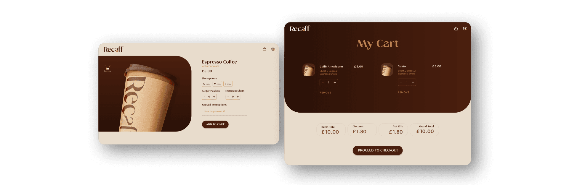
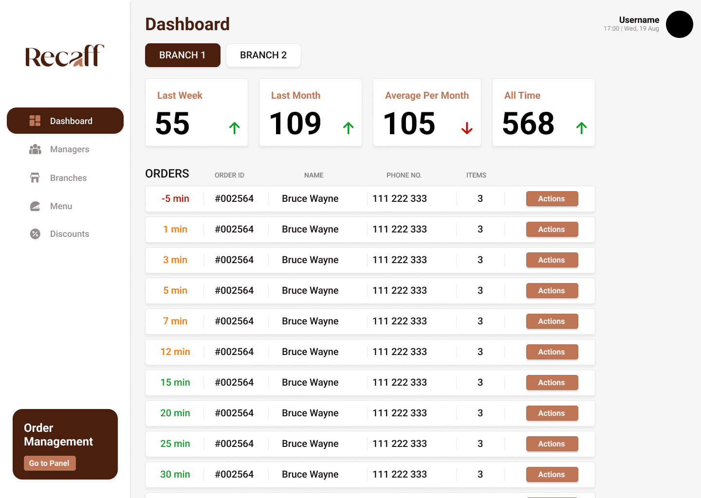
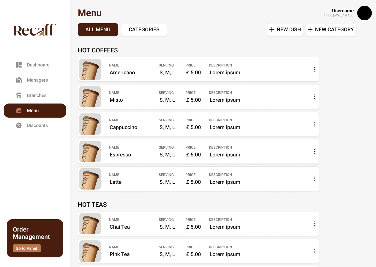
Recaff delivers a complete campus coffee operation system. The mobile web ordering experience allows students to browse a time-contextual menu, customise orders, pay, and receive text-based real-time tracking from a saved link or QR scan at any campus location. The marketing website establishes the brand for campus operators and potential franchise partners. The point of sale system allows baristas to manage live orders with a clear queue and preparation status view. The manager panel allows branch managers to configure menus, set promotions, manage staff, and review order analytics across branches.
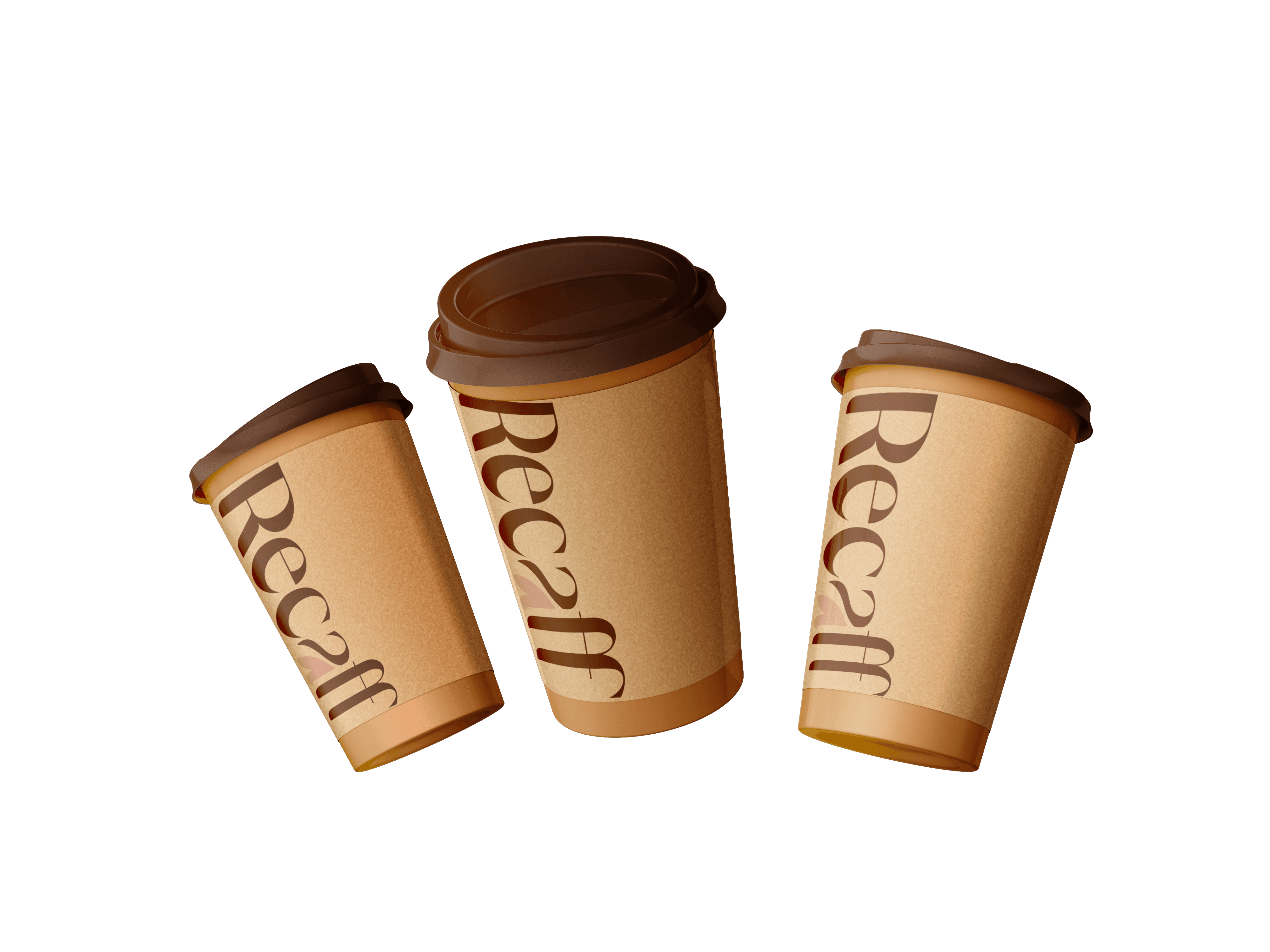
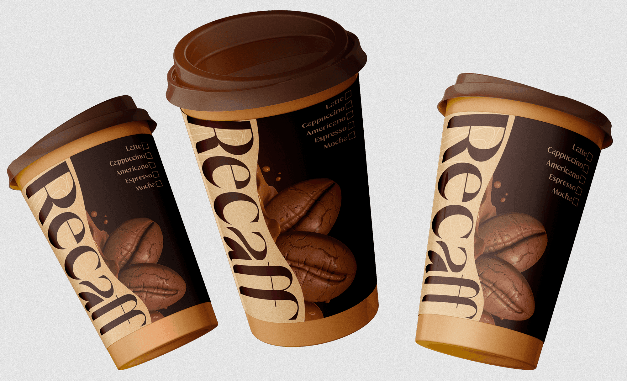
The brand identity used a typography-based logo in warm brown and skin tones, evoking a cozy, inviting atmosphere designed to stand out in a university environment without feeling corporate.



Outcome and Impact:
Recaff was delivered as a complete design-ready system within a 1-month engagement. The product was not developed. The design deliverables, brand identity, and system architecture were completed to production quality. The case study is presented as a demonstration of rapid multi-surface design delivery and research-informed decision-making within a constrained timeline.
Reflection
The strongest decision on Recaff was the mobile web over native app choice. It is counter-intuitive to a client who wants an "app", but the right product decision for a use case with low download motivation. Explaining that decision in a way the client understood required reframing it not as "we are building something less" but as "we are removing a barrier that stops users from trying your product." That framing conversation is as important as the design decision itself.
Disclaimer: The project discussed herein was undertaken as a part of the Little Studio team. The rights to this project are jointly owned by the client and the studio. This case study is presented solely to showcase my individual contributions to the project.