Live at forzite.com | 1-month MVP | Fully Release

My Role: Lead Designer — Branding, User Flows, Wireframing, UI Design, Prototyping, Marketing Website
Platform: Web application (staff dashboard, admin dashboard), marketing website
Timeline: 1-month MVP to live
Status: Live
Live link: forzite.com
Context
Forzite is a pre-operative planning and tracking tool with analytical capabilities for hospital operating rooms. Surgical procedures account for 30 to 40 percent of all hospital annual costs — approximately $187 billion annually in the US. The average OR room utilisation rate sits at 68 percent, well below the target range of 80 to 90 percent. A single OR operating at 68 percent utilisation costs a hospital approximately $62 per minute, $3,600 per hour, $10,800 per day, and $2.6 million annually. Low utilisation also contributes to physician and nurse burnout, staff turnover, overtime, and surgical delays. Forzite operates specifically during primetime OR hours (7AM to 4PM) where the highest-value scheduling decisions are made.
The Problem
Hospital administrators had no unified real-time view of OR utilization. Scheduling data, procedure updates, and staff assignments existed in disconnected systems. Clinical staff inputted procedure updates into EHR systems not built for real-time tracking, creating lag between what was happening in the OR and what administrators could see. The result: inefficient scheduling, delayed procedures, and no actionable data to close the gap between 68 percent actual utilisation and the 80 to 90 percent target.
My Role and Constraints
I was the lead and only designer on Forzite. I owned all branding, both role-based dashboards, and the marketing website from zero to dev-ready. The primary constraint was healthcare context: clinical interfaces have zero tolerance for ambiguity or cognitive load. A staff member tracking a live procedure cannot search for a button. The secondary constraint was a 1-month MVP timeline requiring ruthless prioritization of the highest-value flows for each role.
Research and Discovery
I researched existing OR management software (Epic, Oracle Health, Surgical Information Systems) to understand baseline conventions clinical users were familiar with. Finding: existing tools were powerful but dense, built for administrators who had time to learn them. No tool was optimised for the clinical staff member who needed to log a quick update under time pressure.
Healthcare UX principle applied throughout: every additional click or cognitive decision in a clinical interface is a potential patient safety issue. Minimum viable interaction was a clinical requirement, not a design preference.
Confirmed end goals from the brief: increased on-time surgery starts, increased revenue, decreased physician and nurse burnout, increased surgical cases, and increased autonomy for clinical staff through better tooling.


Key Design Decisions
Decision 1: Two architecturally separate interfaces
Initial thinking was a single platform with role-based access filtering. I recommended two architecturally separate interfaces. Reasoning: the staff user's context (time-pressured, potentially standing, glancing at a screen mid-procedure) and the admin user's context (seated, analytical, comparative across time periods) are so different that a shared interface compromises both. Greyed-out restricted features create confusion for clinical users who do not have time to interpret access logic.
Decision 2: Status-first layout for staff, data-first for admin
For clinical staff: the primary visual element is a large, clear OR status indicator. Procedure input, staff assignment, and EHR sync radiate outward from that single status element. The one question a clinical staff member needs answered immediately is "what is the current status of this OR." For admin: data density is appropriate and expected. Charts, utilisation rates, drill-down from hospital level to OR level to procedure level, and report generation are the primary interactions.
Decision 3: Automatic EHR sync, not triggered
The original spec included a manual sync button for staff to push updates to the EHR. I recommended automatic sync on any status change. Reasoning: a manual sync step in a clinical environment will be skipped under time pressure, recreating the exact data lag the product was designed to solve. Removing the dependency on the staff member completing a secondary step was a patient safety and data quality decision.
The Solution
Forzite delivers two role-based platforms operating from a shared data layer.
Staff Dashboard: Large, clear OR status display as the primary element. One-tap procedure status updates. Automatic EHR sync on every status change. Staff assignment view always visible. Designed for minimum cognitive load in a high-pressure clinical environment.
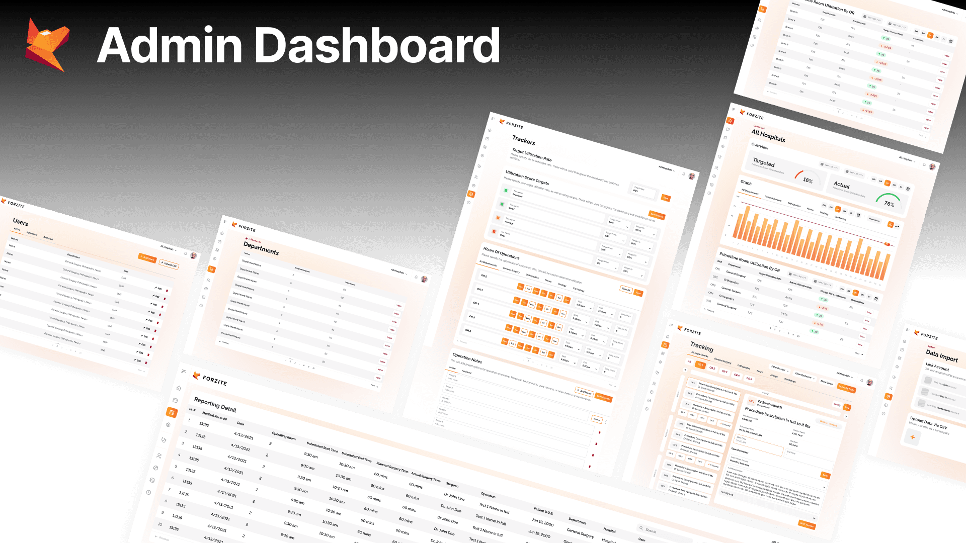
Admin Dashboard: Hospital-level and OR-level utilization statistics. Procedure timeline views across all ORs simultaneously. Staff assignment oversight. Real-time utilization KPI tracking against the 80 to 90 percent target. Detailed reporting and data export.
Marketing Website: Designed for hospital procurement teams and administrators. Clinical-grade visual language: clean, white, technically credible. Value proposition positioned around the financial and operational cost of OR underutilization.


Outcome and Impact
Forzite shipped to production within 1 month of the first design brief. The product is live at forzite.com and positioned for the US hospital market. The 1-month timeline required designing the MVP scope around the highest-impact staff and admin workflows, with more advanced analytics and expanded EHR integrations planned for subsequent phases.
Reflection
Healthcare taught me that the most important design decisions are subtractive. The temptation with data-rich products is to show more. The clinical reality is that more in a time-pressured environment increases error. Every element removed from the staff dashboard was a conscious decision about what a clinical user needs in that moment versus what they might theoretically want. That discipline now applies to every product I design, regardless of domain.
Disclaimer: The project discussed herein was undertaken as a part of the Tech Goes Global team. The rights to this project are jointly owned by the client and the studio. This case study is presented solely to showcase my individual contributions to the project.