Responsoive Websites
W3 Merch:
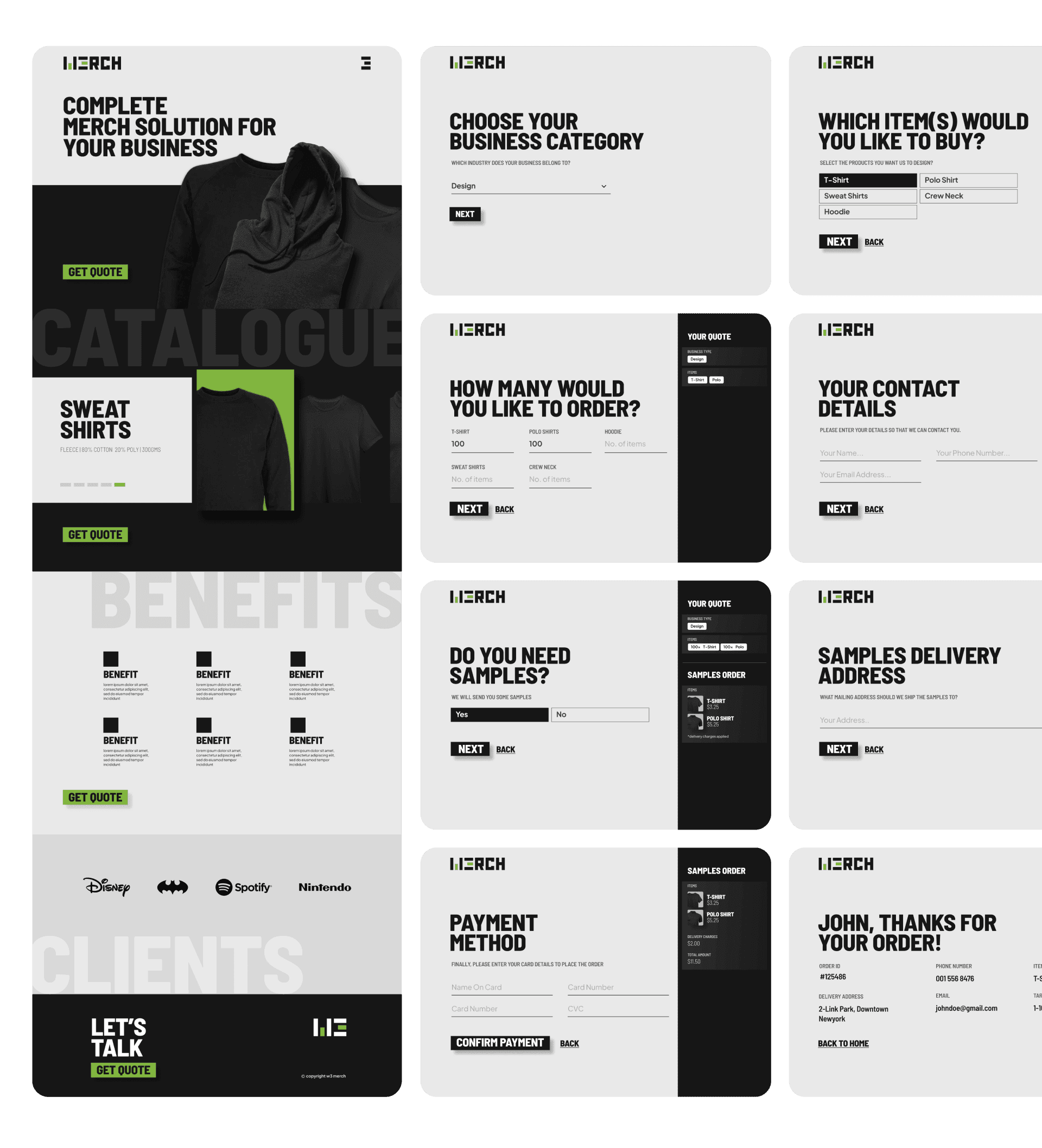
W3 Merch is a retailer specializing in designing and producing a wide range of merchandise, including polos, t-shirts, sweatshirts, and playing cards. The primary objective was to create an appealing online presence that accurately represents the brand and simplifies the process for customers to request custom quotes and samples.
Research and Discovery:
Understanding the Brand: The project began with an in-depth exploration of W3 Merch's brand identity. The brand values of simplicity, quality, and sustainability were identified as key pillars.
Target Audience: A diverse target audience, including businesses looking for custom merchandise and individual customers, was defined.
Competitor Analysis: A competitive analysis helped identify trends in the industry and areas where W3 Merch could differentiate itself.
Branding:
Logo Design: A minimalistic typography-based logo was designed, using black and white as the primary colors and green as an accent color. This logo reflects the brand's simplicity and eco-friendly focus.
Color Palette: The color palette was expanded to include various shades of black, white, and green to maintain consistency throughout the website.
Website Design:
Information Architecture: The website's structure was organized to make product categories easily accessible, with clear navigation menus.
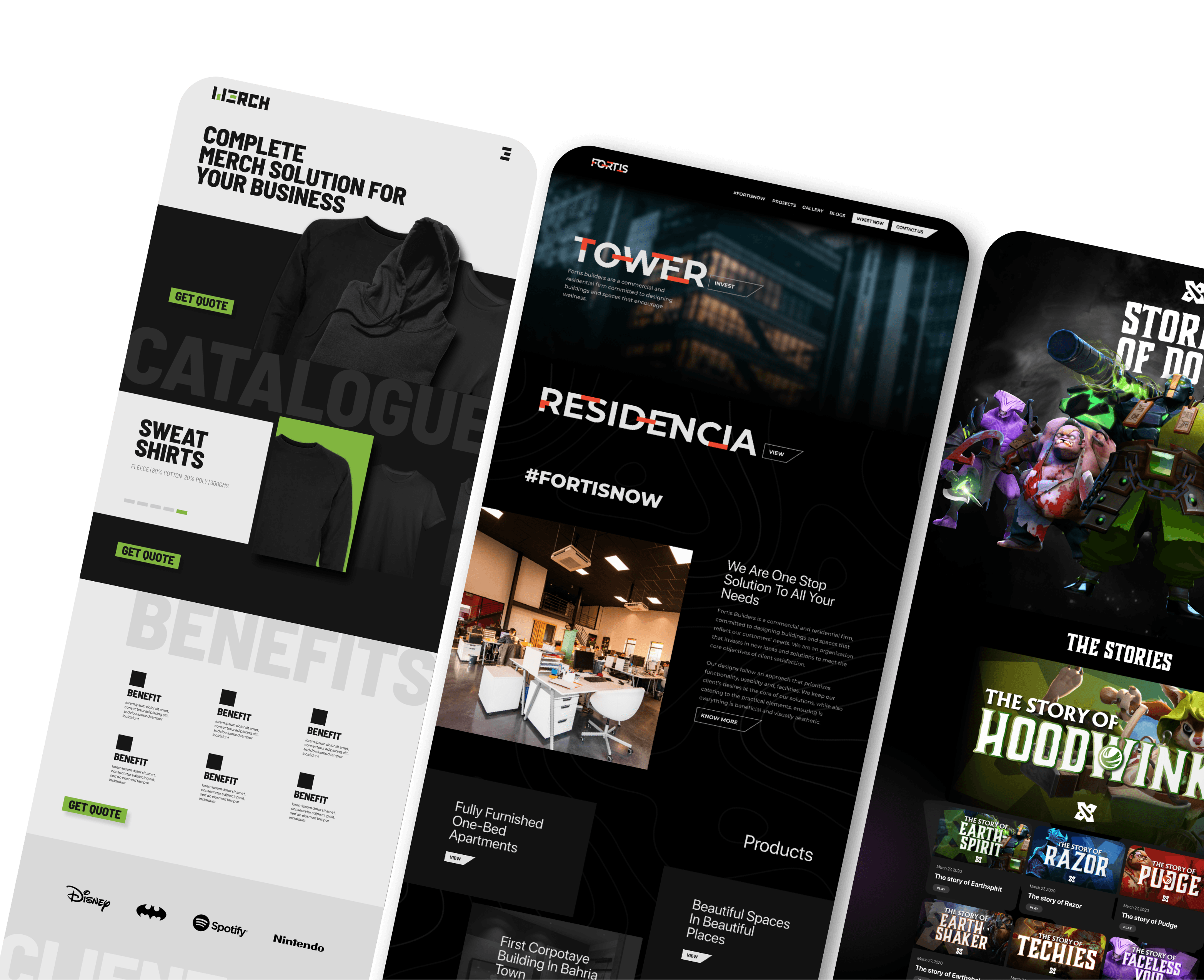
Homepage: The homepage features a visually striking hero section with a rotating showcase of W3 Merch's best-selling products. A brief introduction to the brand's values and a call-to-action (CTA) button directing visitors to explore products were also included.
Product Pages: Individual product pages were designed to showcase high-quality images, detailed descriptions, and pricing information.
Custom Quote Form: A user-friendly Typeform was integrated to streamline the custom quote request process. It collects essential details like product type, quantity, and customization preferences.

Netkom Technologies
Branding and Website Revamp
Netkom Technologies, a leading provider of Network Support Systems (NSS), Business Support Systems (BSS), POWER equipment, Enterprise Solutions, network design, construction, civil works, and supply of testing equipment, embarked on a branding revamp and website redesign project. The goal was to create a modern online presence that reflects Netkom's expertise and diverse offerings. This case study outlines the user experience (UX) design process for two websites: Netkom's main website and Netkom Learning, a platform for training programs.
1. Research and Discovery:
Understanding Netkom: Extensive research was conducted to grasp Netkom's services, values, and target audience.
Competitive Analysis: A thorough analysis of competitors in the telecom industry was performed to identify industry standards and areas for differentiation.
Feedback Integration: User feedback was carefully reviewed and incorporated into the design to enhance the overall user experience.
2. Branding:
Logo and Visual Identity: The existing Netkom logo was modernized while retaining brand recognition. A cohesive visual identity, including a color palette and typography, was established to create a professional and trustworthy image. Complete range of Stationary was created for each region.
3. Netkom Main Website Design:
Homepage: A clean and intuitive homepage design was created, featuring a brief company overview, eye-catching visuals, and clear navigation to key sections.
Navigation: The main navigation menu was structured to include Home, About Us, Services, Projects, Team, Careers, and Blogs for easy access to relevant information.
Projects and Team: Detailed project showcases and team member profiles were added to build credibility and showcase Netkom's expertise.
Careers: A user-friendly careers section with job listings, application forms, and information about company culture was designed to attract potential employees.
Blogs: A blog section featuring articles on industry trends and insights was included to establish Netkom as an authority in the field.
4. Netkom Learning Website Design:
Onboarding Homepage: The Netkom Learning homepage was designed to introduce visitors to the training programs available, highlighting their benefits and ease of enrollment.
Training Programs: A clear presentation of available training programs, including detailed descriptions, schedules, and pricing, was provided.
Partners: Information about Netkom's training partners and affiliations was included to build trust.
FAQs: Frequently asked questions were compiled to address common queries.
Contact Details: A straightforward contact section allowed users to reach out for inquiries or support.
Courses: Detailed course listings, syllabi, and prerequisites were provided for potential students.

Fortis Builders
Websites and Marketing
Fortis Builders, a commercial and residential construction firm dedicated to promoting wellness through their building designs, sought to establish a robust online presence. This study outlines the design process for their website and the subsequent design work for their Facebook and Instagram pages. The primary goals were to showcase Fortis Residencia and Fortis Tower projects, attract investments, provide valuable content, and offer easy contact options.
1. Research and Discovery:
Understanding Fortis Builders: In-depth research was conducted to comprehend Fortis Builders' mission, values, and target audience. Interviews with key stakeholders provided valuable insights.
Wireframes: Wireframes were created to get feedback from potential investors, homebuyers, and design enthusiasts who might visit the website.
Competitive Analysis: A competitive analysis helped identify trends in the real estate and construction industry, informing the website's unique value proposition.
2. Website Design:
Homepage: A welcoming and informative homepage was designed with a hero section featuring both Fortis Residencia and Fortis Tower. The key navigation elements included Projects, Blog, Gallery, Investment Plans, Location, and Contact Form.
Project Showcases: Dedicated pages for Fortis Residencia and Fortis Tower included detailed descriptions, high-quality images, floor plans, and virtual tours where possible.
Blogs: An engaging blog section was created to share insights on wellness-centered design, industry trends, and Fortis Builders' unique approach.
Gallery: A visually appealing gallery displayed images of completed projects, emphasizing the quality and aesthetics of Fortis Builders' work.
Investment Plans: Clear and transparent information about investment options, returns, and benefits was presented to attract potential investors.
Location: An interactive map displayed the locations of Fortis Residencia and Fortis Tower, helping visitors understand the neighborhoods.
Contact Form: A user-friendly contact form allowed visitors to inquire about projects, investments, or general inquiries.
3. Social Media Design:
Facebook and Instagram Pages: A cohesive design approach was applied to Fortis Builders' social media profiles to maintain brand consistency. Visual content, including project highlights, behind-the-scenes glimpses, and design inspirations, was created to engage the audience.
Content Calendar: A content calendar was developed to ensure a steady flow of posts, including project updates, wellness tips, and community engagement.

Stories of Dota
YouTube Channel and Website
Stories of Dota is a series of video documentaries about the competitive and development history of Dota 2 heroes. This study outlines my involvement in designing assets for the YouTube channel and website of "Stories of Dota." The project encompassed various visual elements, including the logo, covers, video thumbnails, and video frames, along with the creation of a dedicated website for video showcases and upcoming hero reviews. The primary objective was to enhance the channel's visual identity and create an engaging online platform for Dota 2 enthusiasts.
1. Research and Discovery:
Understanding the Dota 2 Community: I conducted research to understand the preferences and expectations of the Dota 2 community, which served as the target audience.
Competitive Analysis: A competitive analysis of other Dota 2 content creators and platforms helped identify design trends and opportunities for differentiation.
2. Asset Design:
Logo: A distinctive and memorable logo was crafted, incorporating Dota 2 elements while maintaining simplicity and brand recognition.
Covers: Channel covers were designed to convey the essence of Dota 2, featuring captivating imagery and clear branding.
Video Thumbnails: Eye-catching video thumbnails were created to increase click-through rates and encourage viewers to explore content.
Video Frames Design: Consistent video frames were designed to provide a cohesive and professional look to video content, reinforcing the channel's brand identity.
3. Website Design:
Homepage: The website's homepage was designed to showcase featured videos, provide quick access to hero reviews, and introduce the channel's content creators.
Videos Showcase: A dedicated section allowed users to explore the channel's Dota 2 videos, providing detailed descriptions and easy navigation.
Upcoming Hero Reviews: A section was created for upcoming hero reviews, complete with release schedules and teasers to generate anticipation.
Navigation: An intuitive menu and search functionality simplified the process of finding specific content.
Contact Form: A user-friendly contact form facilitated communication with viewers and potential collaborators.

Minimal Product Showcase
This study outlines the design process of a minimal product showcase website created for a client. The website was developed in both dark and light themes to cater to user preferences. Due to confidentiality, specific product details cannot be disclosed. The primary objective was to create a visually appealing and user-friendly platform to showcase the undisclosed product.
1. Research and Discovery:
Understanding the Product: In-depth discussions and information gathering sessions with the client provided essential insights into the undisclosed product's features, target audience, and unique selling points.
Wireframes: Wireframes were created to get feedback from potential investors, and design enthusiasts who might visit the website.
Competitive Analysis: A competitive analysis was conducted to identify design trends and best practices within the product showcase website domain.
2. Design Concept:
Minimalism: The central design concept revolved around minimalism to emphasize the product's elegance and functionality. This approach focused on clean lines, ample white space, and a simplified color palette.
Dark and Light Themes: Two distinct themes (dark and light) were developed to accommodate user preferences and improve accessibility.
3. Website Design:
Homepage: A minimalist homepage was designed to create an immediate visual impact, featuring the undisclosed product as the primary focal point. The dark and light theme options were readily accessible.
Product Showcase: Dedicated pages showcased the undisclosed product, highlighting its key features, benefits, and high-quality images without disclosing confidential details.
Navigation: An intuitive navigation menu allowed users to easily explore different sections of the website, including About, Contact, and a Blog (if applicable).
Contact Form: A user-friendly contact form enabled potential clients or partners to inquire about the product without compromising confidentiality.

Disclaimer: The projects discussed herein was undertaken as a part of the Little Studio team. The rights to this project are jointly owned by the client and the studio. This case study is presented solely to showcase my individual contributions to the project.
